In this video we walk you through a typical flexible barrier packaging dieline. Topics include: reading the dieline, understanding layers, and how to denote finishes, and clear or unprinted areas. Additionally, basic best practices are included.


In this video we walk you through a typical flexible barrier packaging dieline. Topics include: reading the dieline, understanding layers, and how to denote finishes, and clear or unprinted areas. Additionally, basic best practices are included.
Setting up art files for flexible barrier packaging has it's own little quirks and peculiarities that set it apart from other print setups. But never fear! The same basic techniques and knowledge base you have used for off-set or paper printing can be transferred to flexibles.
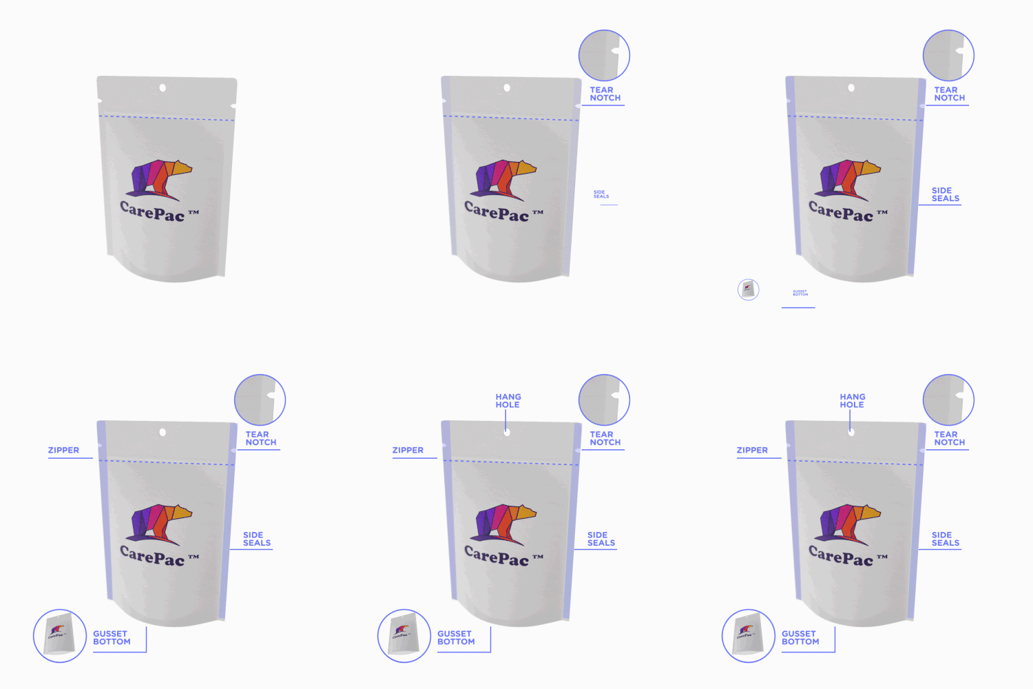
There are two types of dielines you'll see presented. A "multi-up" dieline or a as-print dieline. At Carepac we prefer using multi-up because it makes actual proofing easier, but many times you may work with a dieline that is as print.
1. Zipper location
Yes you can print over the zipper area. Sealing the zipper into the bag does create some wripples / mild distortion so we don't recommend putting important mission critical items in the zipper area.
2. Outer edge of bag
On our dielines the edge is the edge, no additional bleed needed and nothing exists beyond this point. Over the years several customers have thought that the dimensions indicated are ID, inside diameter, which is false. All the dimensions are O.D. Outside diameter.
3. Seal Zone
Seal zones are where the material of the front and back of the bag are sealed together. Seal zones are printable space, the only suggestion is to not put something like a barcode in the seal zone as, similar to zippers, seal zones can have a slight bit of distortion.
4. Gusset Zone
Gusset zones are like seal zones never put a window area in a gusset, as this area will not look good if you put clear window over it.
Dielines use various "off canvas" colors to denote physical elements of the bag. These colors should contrast with the artwork, so they are easy to identify. Tese are technically the dielines. Here are some examples of dieline colors, with their corresponding label.
Pouch designs will include alot of content which is not actually printed on the pouch. This content is there to convey various specifications. For example when designating areas of clear or unprinted area, merely making those areas transparent in the AI file is not a good practice, why? Because white and transparent can be confused, also your AI files are going to be converted to other file formats for printing (for example rip station files) and ensuring that the person making the conversion understands your intensions is key.
It's important to designate various items such as:
The decision of using separate art boards or layers is up to you, but typically we suggest layers, even for "off-canvas" layout information such as white ink base areas. This is because you can overlay layers to ensure their locations correctly correspond to the printed areas.
There are some basic best practices to follow when setting up your layers. Firstly, do not mix the dieline and art layers, this can create errors, and just makes for messy files. Second, if you are designating finish locations for spot UV or matte varnish, use a separate layer for those purposes.
1. Separate Dielines from art
2. All art on one layer
3. Finish designation layer separate from art.
It's very common for designers to forget to outline their text. It is important to outline text to ensure that there are no versioning differences between different versions of a font file. If you've used a paid font, then we won't have that font, and if you've downloaded a free font from DaFont, Fontspace, fontsquirrel, or any of the numerous font sites, they all will have slightly different versions of the file than what we might have.
Messy Color swatches, or failing to setup any swatches is something we see almost daily. Adobe's built in color swatches allows for color separation and is especially helpful when working with spot ink colors, such as Pantone colors. In the picture below the designer has correctly separated and assigned PMS colors to the art work. Spot ink colors are colors created through the combination of specific ink colors instead of CMYK. Spot colors can be more consistent across print runs, and allow for color matching to pantone ink swatch decks.
While talking about Spot colors we should probably address the whole Pantone v. Adobe issues.
Pantone and Adobe have been in a bit of a tussle and pantone colors libraries are no longer a free part of adobe illustrator. This has created some issues as the pantone libraries that are freely available are now out of date. There are a few work arounds that we'll tell you about.
The first is of course the official Pantone Plugin. Pantone has released Pantone Connect which is a paid service, part of which is the pantone connect plugin. If you have the Pantone connect plugin then you have access to all the current Pantone colors (as of writing this Pantone Connect is $59/year).
There are a couple of ways to handle things if you don't pay for the plugin. First lets talk about something most people don't understand, screen color is not the same as color on paper (or plastic). Here's the secret, it doesn't matter if you have the plugin or not, as long as you have the physical pantone book.
Yes you heard me right, whether you have the plugin or not, it's really irrelevant for our purposes because, screen colors are not very accurate to being with. As long as you designate the color number correctly in your color section (and assign it a swatch in the Color swatches), then we'll know what you're talking about. Since for Pantones to have any real value you should be referencing the printed color decks anyways.
One of the most common issues we run into when setting up customer's art is the missing link. It's easy to forget those pesky linked files, but without them we can't take your files to press. So Lets remember to embed the linked files or include the links folder in your export.
This material has a higher than average moisture and strength, with good oxygen and gas barrier. As this is a clear product it has limited light barrier potential but does have good heat resistance. Enhanced heat resistance could be obtained with CareClear-PNC is required by the use application.
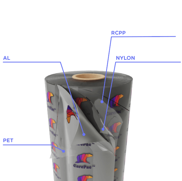
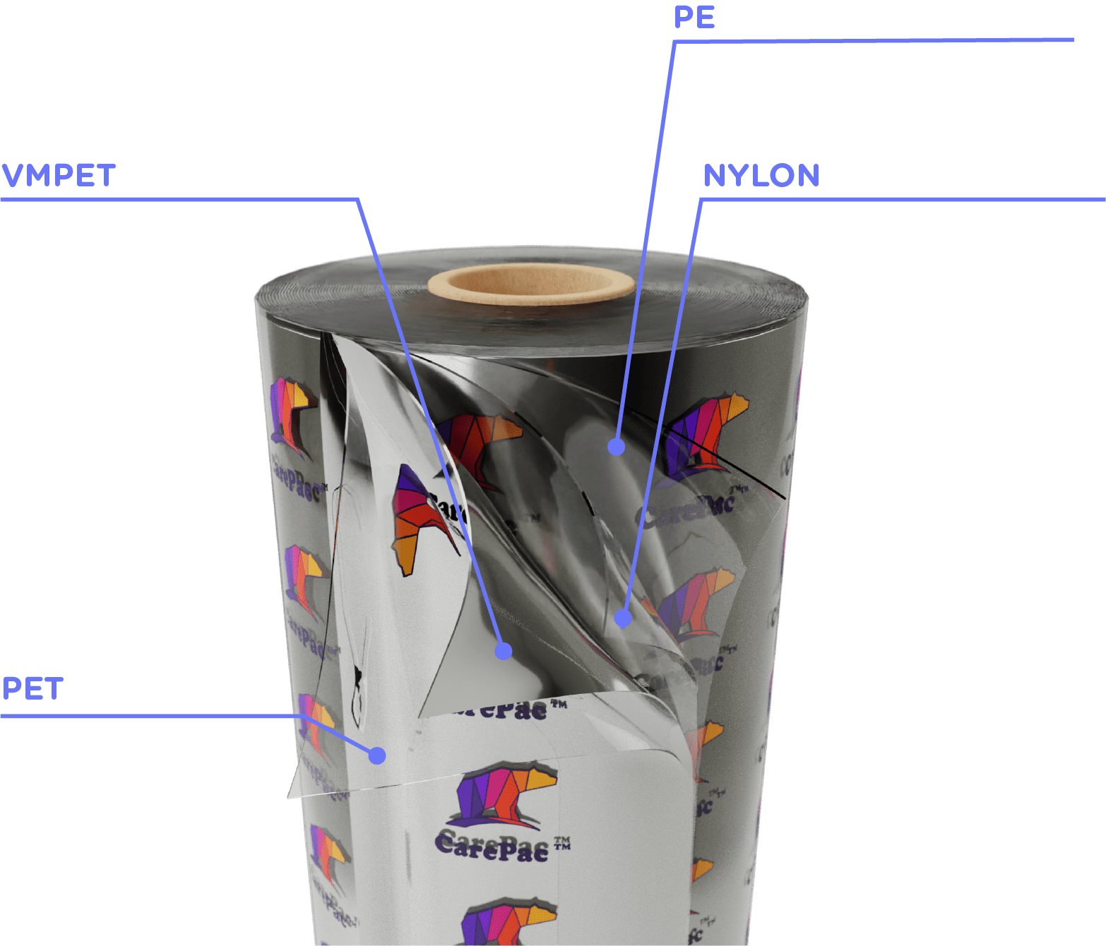
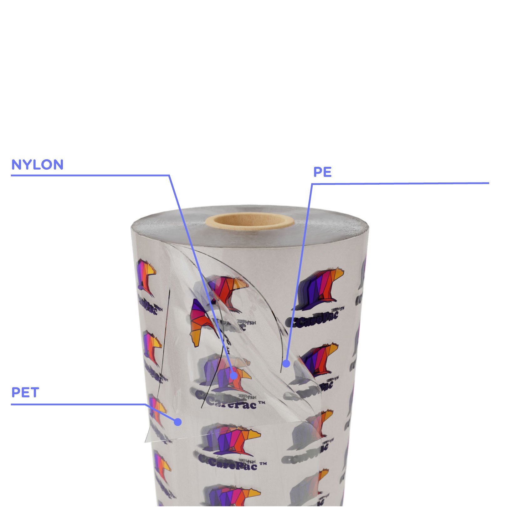
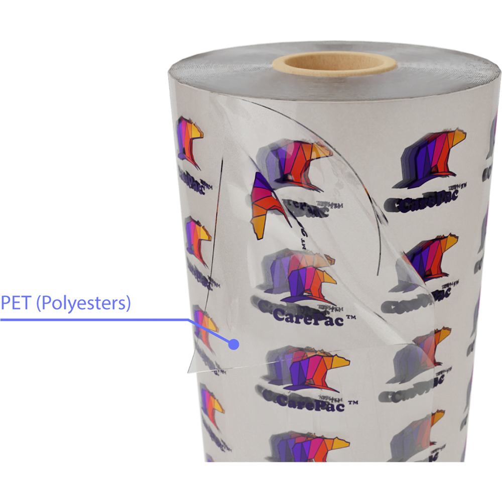
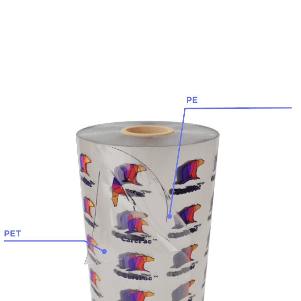
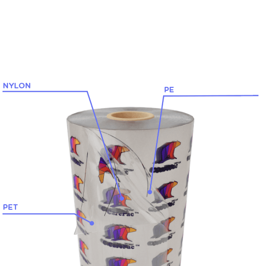
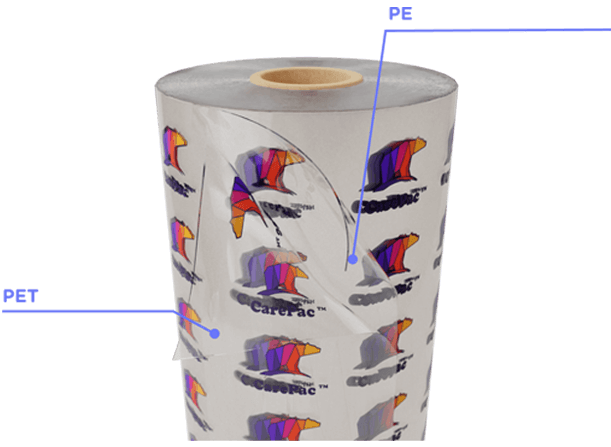
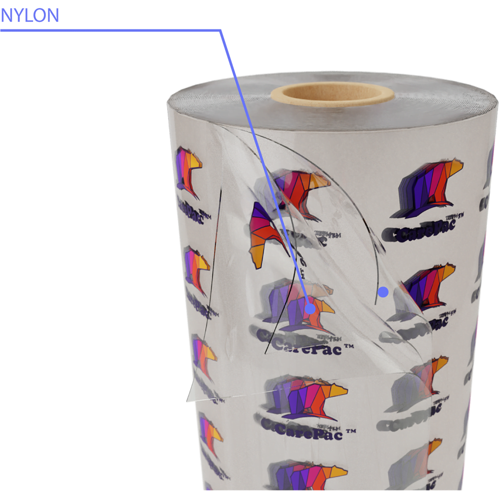
CareClear-PNP (PET/NYLON/PE) is a common lamination structure used in flexible packaging. it is the unique combination of three plastic films (the PET a short form of Polyethylene Terephthalate, Nylon also known as PA, and the PE a short form of Polyethylene) that gives our packaging film or bags its unique technical qualities making it ideally suited for a wide range of applications either for domestic or industrial use.
Oxygen Barrier
Moisture Barrier
Light Barrier
STrength
Heat Resistance
Freezer storage
Note: The performance of any film will be influenced by a number of factors and testing must always be performed to ensure the film meets the use.
The unique combination of PET, NYLON, AND PE enhances tear strength potential to reduce bag blowouts, specifically in powder and liquid packaging applications. This film also helps maintain freshness, extend shelf life and prevent damages to the contents of the package, in a non-rigid form.
Frozen Sea Moss is a widely consumed health and beauty supplement. Sea Moss is a plant product that is stored frozen and the then thawed by the consumer. CareClear-PNP was a good choice in this circumstance because the use case required a pouch with good liquid holding and freezer save material.
Nylon (PA) laminated in the PE/NYLON/PE film/bag is a very tough film with good transparency, good gloss, high tensile strength, good heat resistance, cold resistance, oil resistance. It is excellent in abrasion resistance, organic solvent resistance, and puncture resistance, and is relatively flexible, and has excellent oxygen barrier properties.
PET/NYLON/PE typically offers an excellent oxygen barrier and moderate moisture barrier. It's usually stiffer than other PET/PE films and has superior optical qualities. It exhibits high resistance to oil and acidic product contents, whereas PET/PE films are more likely to absorb and become distorted by those substances. PET/NYLON/PE chemical structure is very stable, which means it shows less stretching during the printing and laminating processes. It’s also revered for its excellent thermal stability.
The synthesizing of Nylon or PA material into PET/NYLON/PET FILM greatly impacts the oxygen and moisture barrier, makes for an opaque barrier to light, offers a high-reflective glossy aesthetic, and opens up new packaging application options unlike other PET/PE films or bags that are deficient in oxygen and moisture barrier as well as the glossy aesthetic. In terms of mechanical properties, such as modulus and tensile strength, PET/NYLON/PE typically outperforms PET/PE. At this time, PET/NYLON/PE is well suited for applications requiring a strong film with high tensile properties, scuff resistance, and durability.
The synthesizing of Nylon or PA material into PET/NYLON/PET FILM offers an improvement in the moisture barrier.
Here are some of the common indicated properties for PET/PA/PE:
Property | Sample Data |
---|---|
Available Thicknesses | 3mil - 8mil |
Sample Data Thickness | 5 mil +/- 5μ |
MVTR | .224 gms/100 sq.in./24hrs |
OTR | 2.7 cc/100 sq.in./24hrs |
Tensile Strength | >42.1 (MD), >42.1 (TD) |
Elongation at Break | >55 (MD), >50 (TD) ASTM D 882 |
Bond Strength | PET/NYLON >400, NYLON/PE >400 g/15mm |
Tear Strength | >1.6 (MD), >1.2 (TD) ASTM D 1938 |
Thurst | >84.6 JAs St. (fed-std-101-2065) |
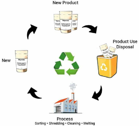
PET/NYLON/PE is theoretically recyclable, but the energy required to separate out the plastics from the lamination structure mean that, except for specific jurisdictions, PET/NYLON/PE often is not recycled. PET/NYLON/PE can be commercially recycled by thorough washing and re-melting, or by chemically breaking it down to its component materials to make new PET/NYLON/PE films or bags.
Not Compostable
Recyclability Varies
Property | Sample Data |
---|---|
Recyclable | Multi-Layer Check Locally |
PCR Option Available | Yes |
At Home Compostable | No |
Commercial / Industrial Compostable | No |
BPA FREE
FDA Food Approved
PROP 65
Property | Sample Data |
---|---|
CEPE/EuPIA | Manufactured in accordance with |
Cal. H&S (25214.16) | Compliant |
PFAS - perfluoroalkyl and polyfluoroalkyl § 37-0209, RCW 70A.222.070 | Does not knowingly add |
Prop 65 (OEHHA) | Does not contain listed substances |
SR 817.023.021 | Not in excess of overall or specific migration |
EU directive 10/2011/ED | Compliant |
EU directive 1935/2004 | Compliant |
FDA 21 CFR 73 | Compliant |
Cal. H&S (25214.16) | Compliant |
RoHS Directive 2011/65/EU | PASS |
POLYETHYLENE TEREPHTHALATE (PET)
Polyethylene Terephthalate (PET) or Polyester is a high-performance, crystal clear thermoplastic made from Ethylene Glycol and Dimethyl Terephthalate (DMT). PET is the ideal material for laminating films or bags for quality printing and lamination as well as good choice for high-performance plastic films and sheets. It has a relatively high melting point, which makes it the best choice for applications that demand high temperature sterilization.
POLYETHYLENE (PE)
Polyethylene or PE is known for its durability, lightweight thermoplastic with a varying crystalline structure. Polyethylene is used in applications ranging for films, tubes, plastic parts, laminates, and so on, in numerous packaging options including Beverages, Meat, Fresh Products, Baked Goods, Frozen Foods, For Industrial Packaging & Construction Materials, etc.
NYLON (POLYAMIDES, PA)
Nylon or Polyamides (PA) is a major high-performance engineering thermoplastics class because of its good balance of properties.
Nylon or PA is used because it is a substitute for low – strength metals in applications like automobile engines, and because of its high strength (relative to other plastics), high temperature resilience, and a high chemical compatibility.
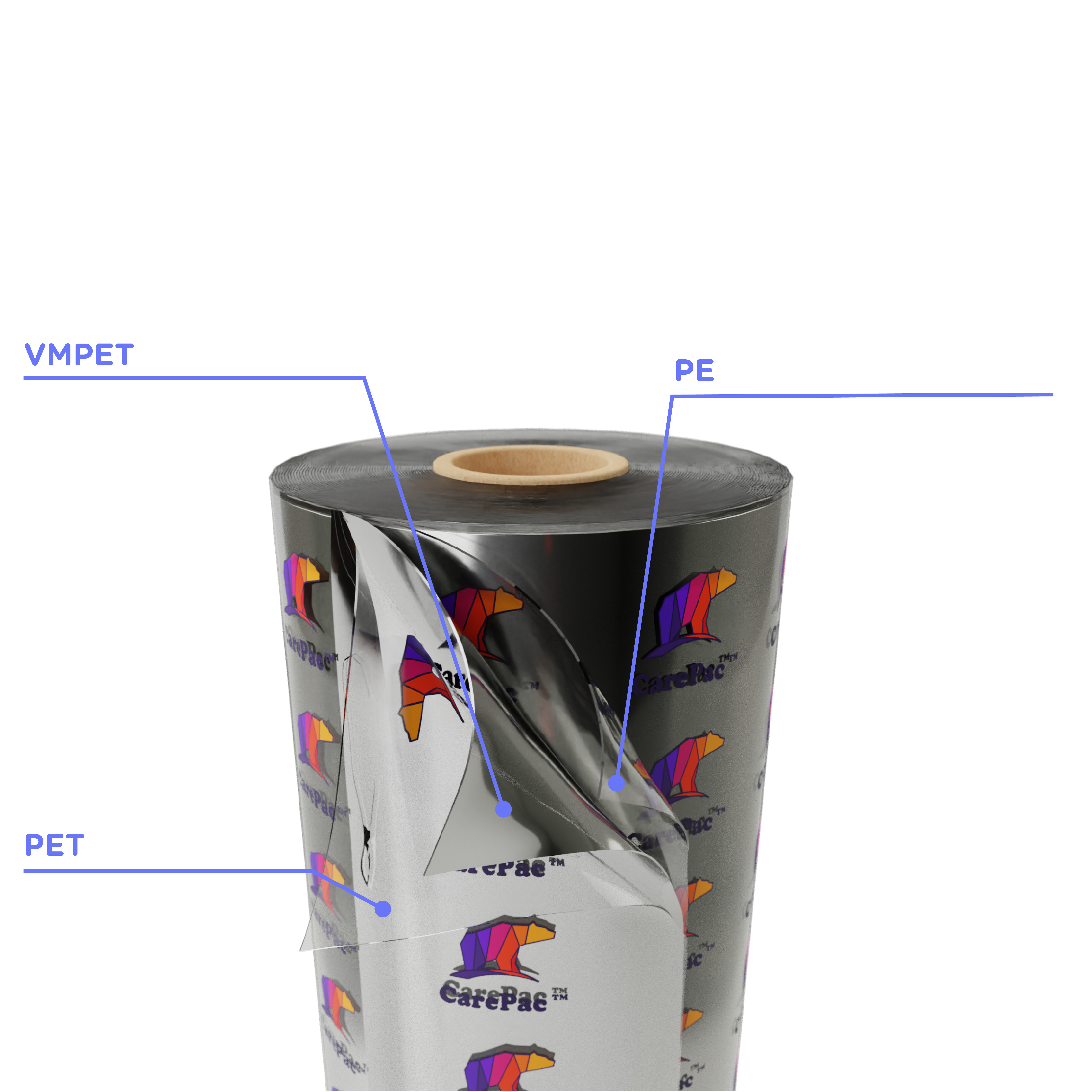
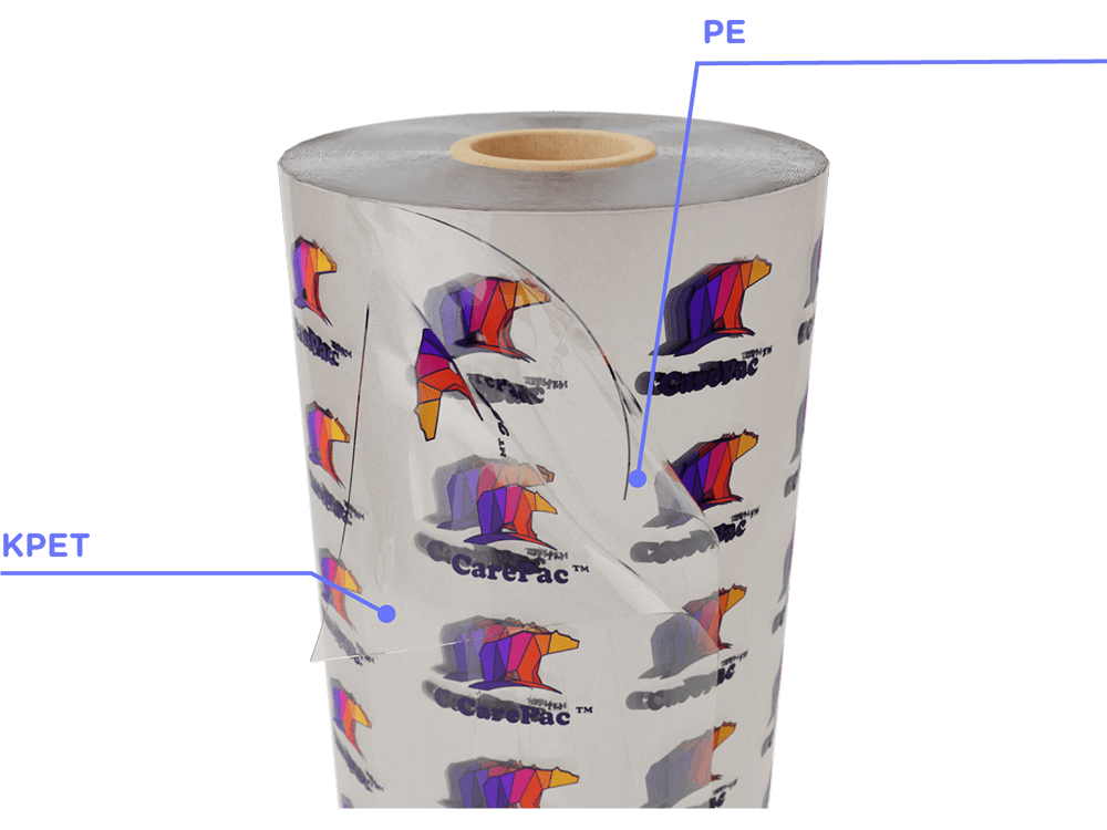
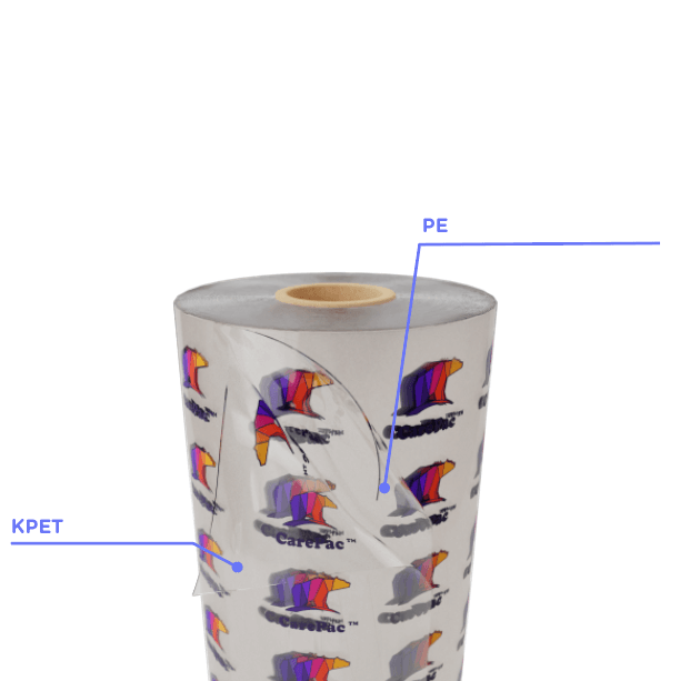
This variation on the Nylon theme adds aPvDC coating to the PET layer to enhance OTR barrier functions of the film. XNP retains the Nylon layer for enhanced strength creating a KPET/NY/PE laminated film.
When the the addition of Nylon / PA is not required a more economical choice is CareClear-PP a very common PET/PE laminated barrier film.
PVDC coated KPET KPET/PE provided extra barrier for applications which need enhanced WVTR and OTR, with the greatest increase being for OTR barrier. This film does not contain nylon.
What does it mean to outline text? Outlining text converts text in your file from editable text elements to press ready vectorized un-editable shapes. In essence it changes the text to shapes like the rest of your design.
Why is outlined text important? Outlining text is important because it ensures your text prints correctly.
Important: Save a backup copy with editable text incase you need to make adjustments.
How to Outline Text: For each AI file, please perform the following tasks.
1. Select -> Object-> All Text Objects
2. Type -> Create Outlines
3. Save AI file and send back.
Step 1
Step 2
The gummy candy market is exploding -- and it’s not just limited to sour gummy worms and gummy bears anymore. Gummy vitamins and THC/CBD gummies are growing in popularity, too. So, how can you make your gummy product stand out from all the noise? High-quality, beautiful gummies packaging -- that’s how!
Show off your product’s personality with custom gummy bear packaging that’s designed just for you. Because, let’s face it, that brown, wholesale packaging is doing you no favors. There’s a time and a place for that kind of packaging, but your gummy candies, vitamins, or cannabis products aren’t it. In this blog, we’ll cover what to look for when packaging gummy products so you can make an educated decision. But first, let’s take a peek at the market growth of gummy products and accessories.
Within the candy industry, the popularity of gummy products is exploding. Just two or three decades ago the only gummy options were gummy bears or worms, but now there’s a gummy product in virtually every size, shape, and flavor. And don’t forget about sour gummy products!
Did you know that the global gummies and jellies market is predicted to reach $40 billion by 2024? Yep, you read that right -- $40 billion! North America is the big winner in the gummy market share, with gummies made in the United States accounting for more than 80% of total gummy revenue. Whether you’re a gummy candy manufacturer in the United States or not, the fact of the matter is that you need to be competitive to stay afloat in this highly competitive market.
And it’s not just the popularity of gummy candy that’s growing, either. In recent years, as cannabis becomes legalized for health and recreational use throughout the United States, gummy cannabis products are growing in popularity, too. And don’t forget about gummy vitamins! In the past, vitamins were chalky and had little to no flavor and now they taste just like candy!
So, you get it -- gummy products are super popular and your product simply needs to make an impact. Read on to learn how custom gummy packaging can help your product stand out on shelves.
Your gummy packaging is your customer’s first impression of your product -- why not do your best to make it a good one? Great packaging will make your current customers remember your brand and will help convince potential customers to give your product a try. Packaging can help communicate your brand propositions through color, shape, and other design elements.
When it comes to gunny packaging, here are seven different design options to consider:
A clear window is a design element that’s intended for the customer, as it’ll give them a view inside. This is especially important if your product is brightly colored or contains sugar crystals.
Not everyone wants to eat an entire bag of candy at once. By making your bag resealable you can give your customers confidence that the snack inside will stay fresher for longer.
With our custom digital printing you can “wow” your customers with bright colors and graphics. We can add your logo or incorporate your brand colors onto your branded mylar bags!
Have you ever held a wrapper or product pouch that just feels high-quality? Soft touch packaging just screams upscale, so take your customer’s experience up a notch with premium packaging options.
If you’re looking for packaging solutions for your cannabis or vitamin gummies, you’ll need to ensure you’re using a child resistant mylar bag. Our edibles mylar bags are the perfect choice!
Another important aspect is smell-proof packaging options. Our smell-proof gummy packaging will keep the scent of your product inside the package -- where it belongs.
One thing you probably haven’t thought about is the experience of your designer. Fortunately, we can provide a referral to a great designer who has plenty of experience in the flexible packaging space.
As you can see, there are a lot of different things to consider when shopping for gummy packaging. Have questions? Need help? Our customer service agents are super friendly and can help you design the gummy packaging of your dreams.
Contact us today!
We could have included this up above, but we felt it deserved its own section: you simply CANNOT forget about the barrier in your plastic bags. While tins may look stylish and chic, the truth of the matter is that they do nothing to keep your product fresh. Metal tins and cans are fine for one-time use products, but for snacks or wholesale products you simply need to select a barrier pouch.
Flexible barrier pouches will protect the product inside from the elements -- meaning your product won’t be exposed to excess oxygen or moisture every time it’s opened. If you’re packaging a gummy product that’s going to be consumer over time (including gummy vitamins or cannabis gummies), a barrier pouch is your best chance at keeping that product fresh.
Now that you understand the importance of barrier pouches and know the important design features you should consider, you’re probably wondering HOW to create your gummy packaging design. Well, it’s easy! Simply partner with a gummy packaging design company (like CarePac) and we’ll walk you through the process.
We sell commercial grade FDA approved stand up pouches and barrier packaging. In addition, we have a collection of stock size packaging or customized options to choose from, all to fit your unique needs! Whether you are just starting a new project or considering switching suppliers, talk with us to see how your product can benefit from our quality packaging.
As you design and produce your gummies mylar bags, it’s important to find a packaging partner that offers all of the above -- and then some! When you partner with a flexible packaging company that specializes in digital printing, low order minimums, short lead times, and stellar customer services, you can rest assured that your product packaging is in good hands. Plus, we have the equipment necessary to product a beautiful product in a short amount of time.
For decades, the coffee industry fought against Proposition 65, a California law that requires warning labels on consumer products that contain chemicals known to cause cancer. Since roasted coffee beans, and the coffee brewed from them, contains acrylamide -- a chemical of concern under Prop 65 because of potential cancer risks -- coffee roasters, chains, and cafes had to include this warning on their products. Or at least they did until 2020, when a judge ended a decade-long lawsuit alleging that dozens of California coffee roasters and retailers, including Starbucks, violated Prop 65.
In this blog we’ll discuss the history behind Prop 65, how it affected the coffee industry, and what the 2020 ruling means for coffee roasters and retailers in the state.
Prop 65 is a consumer products law that requires California consumers to receive warnings about the presence of chemicals known to cause cancer or reproductive harm. If you live in California, you’re familiar with the warning -- it can be found pretty much anywhere, from the backs of French fry boxes and electronic products to signs on the entrances of public buildings. The warning is so commonplace that it’s virtually impossible to go a day without coming across one.
It became law in November 1986, when California voters approved it by a 63-37 percent margin. It’s clear that voters want to be warned about toxic chemicals, but the law is constantly evolving, controversial, and exceedingly difficult to enforce. For example, the list of toxic chemicals includes over 900 chemicals, some of which are environmental, naturally occurring, and impossible to avoid, like acrylamide, the “problem chemical” in coffee, fried chicken, and burnt toast, among other foods.
Acrylamide is a compound commonly found in cosmetics, toiletries, papers, and textiles, but it also forms naturally during high-heat cooking methods, including fried, baked, and roasted foods. It’s more likely to accumulate when foods are cooked at higher temperatures for longer periods of time. Considering coffee beans are typically roasted at 370-540°F for up to 20 minutes, and coffee is only coffee if the beans are roasted, it’s impossible for coffee to NOT include acrylamide.
Food and cigarette smoke are the two major sources of acrylamide exposure for the general population, although it’s important to note that people who smoke have 3-5x higher levels of acrylamide markers in their blood than non-smokers, regardless of their diets. Problem foods include French fries, potato chips, crackers, bread, cookies, breakfast cereals, canned black olives, prune juice, and coffee.
Although various studies have shown a clear link between acrylamide exposure and an increased cancer risk in lab animals, studies on the effects of acrylamide on cancer development in humans have mixed results. In fact, the National Cancer Institute and the American Cancer Society point out that no scientific studies convincingly link acrylamide in food to cancer or other such health issues in humans.
Here are links to just a few studies and a brief look at their results:
A 2015 study on dietary acrylamide and cancer risk concluded that it’s not associated with a higher risk of the most common types of cancer.
Another large review noted no significant association between dietary acrylamide and cancer.
According to this review, it could be tied to a higher risk of lymphatic and skin cancer in men.
As you can see, the results are mixed and it’s important to note that these are observational studies -- they look at the association between acrylamide and cancer but don’t account for other factors that may be involved, such as lifestyle or family history. Per Healthline, additional long-term trials are needed before a link between the two can be determined.
Despite the clear lack of evidence showing that acrylamide in food increases cancer risk in humans, a lawsuit was filed in 2010 that alleged that acrylamide in coffee poses a significant cancer risk in consumers and, as a result, required a Prop 65 warning. For obvious reasons, coffee roasters and retailers in the state fought back against the litigation.
After all, hundreds of independent, peer-reviewed scientific studies show that drinking coffee may actually reduce the risk of certain diseases, including liver cancer, endometrial cancer, Parkinsons, Alzheimers, and diabetes, among others. Plus, the World Health Organization, after reviewing the total body of research regarding coffee and its link to cancer, concluded that coffee is not a known carcinogen and may even help protect against some types of cancer.
Despite the growing body of evidence in favor of coffee roasters, they lost a Phase 1 trial and agreed to include Prop 65 warning labels on their products and in their stores. On top of that, they also agreed to pay millions in a settlement as the litigation moved along. This was bad news for coffee roasters, who were concerned that the warning labels were not only unnecessary but infringed on the accessibility of their products in the state. Fast forward to 2019, when everything changed.
In June 2019, the California Office of Environmental Health Hazard Assessment (OEHHA) adopted a regulation stating that the acrylamide in coffee is created by coffee bean roasting and brewing and does not pose a significant danger to consumers, exempting coffee from a Prop 65 warning. This came one year after the FDA issued a statement in support of such regulation. On August 25, 2020 a California court judge officially ruled that the defense had successfully relied on OEHHA’s regulation to show that acrylamide found in coffee doesn’t cause cancer -- and the rest is history.
So, what’s this ruling mean for coffee roasters and retailers in California? It means they no longer have to include Prop 65 warnings on their products. But, on a larger scale, it also highlights the long debated “value” surrounding consumer product warnings. How long will chemicals, such as acrylamide, with no proven cancer risk to humans remain on the list? Why is the burden on consumers to determine whether the Prop 65 warning on their food is legitimate or not?
Regardless, one thing is for certain: coffee companies and roasters in the state are officially exempt from Prop 65 warnings and can concentrate on what they do best: roasting the perfect cup of Joe.
As a coffee packaging distributor, we get a lot of questions from our California-based customers about Prop 65 warnings on their packaging. Here are just a few.
Nope! OEHHA’s 2019 regulation, which became effective in October 2019, means that coffee roasters are exempt from Proposition 65 warnings. Per their statement, chemicals in coffee pose no significant risk to consumers.
They either don’t know about the latest information or are using old packaging. Since businesses had been given warnings prior to the 2019 ruling and are likely still using older packaging -- after all, as a coffee company, you know how expensive packaging can be.
The results are mixed. Some studies show a small risk, while others show no risk at all. Ultimately, more long-term studies need to be done before any kind of solid link is proven between coffee and cancer.
A warning could be required if another of the 900 chemicals is added to it, or if the product is somehow contaminated during the roasting, packaging, or brewing process. At this point, though, we think it’s unlikely that coffee in its current state will require a Prop 65 warning in the future.
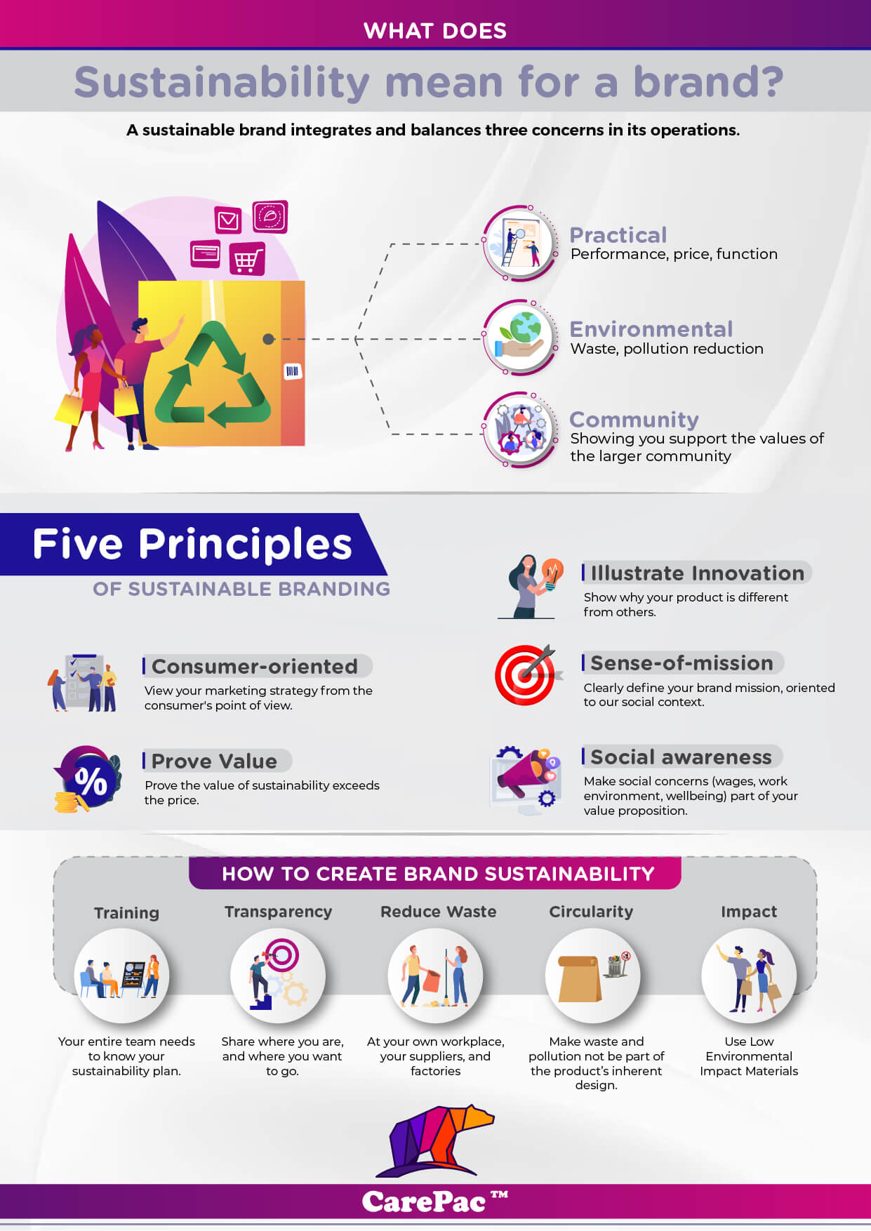
A recent study revealed that 85% of global consumers have changed their buying habits in the past five years to increase their sustainability.
Another study from IBM found that of consumers who said sustainability is important to them, 70% would pay a premium price to support more sustainable and environmentally responsible brands.
Consumers are demanding more sustainability from brands, and they’re willing to invest in products from companies playing their part to help the planet. How can brands keep up with consumer demand and take steps toward going green?
One simple way companies — particularly those in the consumer packaged goods (CPG) sector — can appeal to these consumers and do their part to help the environment is to invest in sustainable packaging material.
The term “green packaging” refers to packaging that is more environmentally friendly than standard options companies may choose for their products.
Other names for green packaging include:
Eco-friendly packaging
Eco packaging
Sustainable packaging
Sustainable packaging options can also be broken into several different categories depending on the materials it’s made from and how it’s disposed of.
Green packaging can include:
Did You Know? All compostable packaging is biodegradable packaging but not all biodegradable packaging is compostable.
Plastics also take years to break down. Plastic bags can take 20 years to break down — and coffee pods can take 500, according to the World Wildlife Fund. Even as they break down, plastics aren’t naturally occurring, so they break down into smaller pieces. They can break into tiny particles called microplastics that are anywhere from five millimeters small to microscopic.
When these plastics get into the environment, their effects can be detrimental. They end up in waterways and oceans, where animals mistakenly or unknowingly ingest them.
These microplastics not only harm the animals themselves but can filter back to humans through the food chain.
Microplastics can also end up in soil and on beaches, where they let off toxic chemicals. This can all filter into crops and human food systems, causing further damage to the ecosystem.
They can break into tiny particles called microplastics that are anywhere from five millimeters small to microscopic.
When these plastics get into the environment, their effects can be detrimental. They end up in waterways and oceans, where animals mistakenly or unknowingly ingest them. These microplastics not only harm the animals themselves but can filter back to humans through the food chain.
Containers and packaging made up to 82.2 million tons of municipal solid waste in 2018, according to the Environmental Protection Agency (EPA). Plastic containers and packaging alone accounted for an estimated 14.5 million tons of this waste.
Of Polyethylene terephthalate (PET) bottles and jars — the material most plastic products are made from — the agency estimated that only 29.1% was recycled.
Whether brands use recycled materials in packaging or make the packaging itself recyclable, green packaging lessens environmental impacts to benefit the planet.
When brands choose green packaging, that has a positive impact on the earth, its ecosystems, and overall sustainability.
McKinsey & Company found that more than half of consumers in the U.S. are worried about the impacts of packaging on the environment. These consumers are also interested in both recycled and recyclable options.
When companies supply consumers with green products and packaging and meet their demand for sustainability, that increases customer satisfaction. This is essential for brand loyalty and companies to grow their bottom line.
Packaging made from recyclable materials can be tossed in a bin and recycled at standard facilities.
Some common recyclable packaging materials include:
Glass
Paper/Cardboard
Plastic
However, not all plastics may be recyclable. Some common recyclable plastics include:
High-Density Polyethylene (HDPE)
Polyethylene Terephthalate (PET)
Polypropylene (PP); Not accepted by all recyclers, but an increasing number are
These materials are from other products or packaging that have been used and recycled into new packaging.
This helps keep materials in use rather than going straight to landfills. Often, this packaging can be recycled again and further kept in a circular life cycle rather than being disposed of.
Packaging that’s recyclable or made from post-consumer recycled materials are both great green packaging options for a variety of products — including:
Pasta and dried goods
Nuts and seeds
Powdered products
Candy, chips, and crackers
Sustainable packaging is designed to have a circular life cycle — where it’s kept in constant use rather than heading to the landfill.
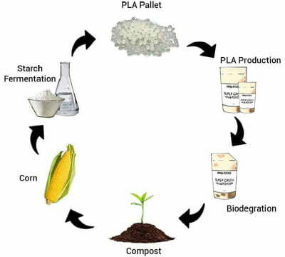
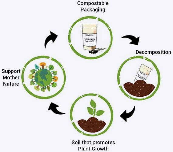
Sustainable packaging is made from plant-derived, natural materials and meant to return to the earth’s natural systems to help them regrow. Compostable packaging breaks down and returns to the earth, helping its natural systems flourish — rather than polluting them.
Sustainable packaging may also be referred to as “biodegradable” or “compostable” packaging.
There are multiple kinds of compostable packaging, which may need to be disposed of differently depending on how they’re made and the materials used to make them.
Industrially (commercially) compostable materials
These materials can be composted in an industrial composter.
Ambient (home) compostable materials:
These materials are compostable by consumers at home in any traditional composter.
Industrial composting typically uses biologically produced heat to break down materials at a higher temperature than ambient composting.
Sugar Cane
Starch
Corn
Unlike traditional plastics and other materials, when these materials break down, they don’t release harmful chemicals and toxins into the environment.
Businesses make many positive impacts on the planet with products that have a sustainable package.
Lower greenhouse gas emissions
No toxic chemicals in the environment
No harmful microplastic pieces
While it may seem like more of an investment upfront, sustainability can boost companies’ bottom line.
Choosing more eco-friendly ways to run a business and making commitments to being a green company can cut costs, attract and retain better talent, and provide tax incentives.
It can boost brand loyalty — customers pushing for brands to be more sustainable are more likely to reach for green packaging that’s better for the planet. With consumers willing to pay more to support sustainable brands, that’s also a boost to companies’ profits.
Spanning all end-use segments, McKinsey & Company found that 60-70% of consumers would be willing to pay more for sustainable packaging. They would buy more sustainably packaged products if they were labeled clearly and readily available.
Even if sustainable packaging is more of an investment up front, a majority of consumers are willing to pay more for products from companies that offer green options.
If you’re looking to go green with your packaging, you may be debating: “Is sustainable or eco-friendly packaging better for my business?”
The most eco-friendly packaging is sustainable packaging, but it may not be suited for all products — like those that need a high barrier or high strength application, pharmaceutical packaging and baby food, or spout patches.
In this case, recyclable packaging is your best bet.
If you’re searching for a great recyclable package option, our 5005 Recycle-Ready and 5006 Recycle-Ready packages are great choices.
The 5005 is made with a biax PE and is Code 4 recycled-ready. While it has a lower barrier than traditional plastic lamination, it has good clarity and can have a matte varnish.
Our 5006, meanwhile, is made with a cross laminate material with a PP base. A Code 5 recycle-ready package, it has a slightly higher barrier and strength than the Code 4 material. It also comes in both matte and gloss options.
2-Seal Pouch
3-Seal Pouch
Fin Seal Pouch
Stand Up Pouch
While not typically as high-barrier as traditional or recyclable packaging options, compostable packaging is made of materials that make it still suitable for shelf stability needs.
There are different kinds of sustainable packaging that may be right for you, depending on what you’re looking to sell:
3-Seal Pouch
Non Printed Custom
Stand Up Pouch
Eco Friendly Poly Mailer
Tubing
BioPBS (PTT/ Mitsubishi Chemicals):
CareCompost KP:
CareCompost NPT:
Whether you’re looking to meet consumers’ desire for a more sustainable world, or you’re trying to jump into the circular economy, sustainable packaging is a significant step to take toward a better planet. Consider eco-friendly packaging for your product needs.
Customizable for your branding and products, we offer a range of recyclable and compostable green packaging to help you reach your goals — all without sacrificing the quality and shelf life of your products.
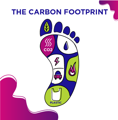
With green packaging solutions, you can reduce your business’ carbon footprint and build customer trust — a win-win for the environment and your brand.
Check out all our green recyclable and compostable packaging options online, or call to find the best packaging to suit your needs.
Managing packaging materials with a sustainable, circular economy in mind is key to addressing the enormous amount of packaging waste that hits landfills every year. A circular economy is designing a packaging strategy with zero waste in mind. Currently, around 91 percent of packaging waste is sent to landfills or ends up in the environment. In 2019, U.S. landfills released around 114.5 million metric carbon tons of carbon dioxide equivalent of methane into the atmosphere.
Methane is 25 more times potent than carbon dioxide in accelerating global warming. There is tremendous opportunity for businesses to reduce and/or redesign the current packaging industry by investing time and resources into supporting and utilizing sustainable materials. In this article we discuss what constitutes sustainable packaging, why sustainable packaging materials are important, and review the various environmentally friendly packaging options available in the market. here...
Before diving into the various sustainable packing options available, your business should actually make a point to also develop reduction and reuse goals. The most sustainable option is to simply use less materials, and many times businesses discover there are untapped opportunities to reduce packaging demand or to integrate innovative, sustainable ideas into packaging. Many of these untapped opportunities also reduce costs. An example would be to reuse cardboard boxes received from vendors to pack outgoing products, increasing the usefulness of the cardboard boxes, and reducing the need for your business to purchase additional cardboard.
Other ideas include reducing the size or quantity of packaging, reducing the thickness of packages, switching to bulk ordering for inbound packaging, and working with vendors to establish take-back programs and utilizing packaging that can be reused. It is important to note that not all of these strategies may also apply to your business or your products, and that they must be fully vetted to ensure they match your product needs. The most effective, comprehensive sustainable packaging strategy is to work to reduce and reuse resources while sourcing packing.
Sustainable packaging is a broad term that encompasses many different realms of sustainability.
These criteria are a suggested framework for understanding sustainable packaging, and it is important to note that many sustainable packaging materials will include some (but not all) of the above criteria. Implementing sustainable design techniques into packaging is designing packaging with the main end-goal of doing as little harm to environment as possible. There are many ways to achieve this, and design is one technique to include in your overall materials strategy. When looking to understand and design sustainable, flexible packaging, keep the Sustainability Packaging Coalition’s sustainable packaging principles in mind.
Investing in sustainable packaging helps reduce your company’s carbon footprint and shows a commitment to improving and protecting the planet. Whether it is candy, cosmetics, spices, coffee, food, or any other packaging, the quality of a packaging product is increasingly determined by the sustainability of the product. Additionally, investors and consumers alike are demanding that companies prove their commitment to meeting sustainability goals, pledges, and promises, through meaningful, measurable actions throughout the supply chain.
Companies are beginning to turn their backs to the continued use of plastic packaging materials (when possible), and to stay relevant and competitive within the realm of sustainability and ESG your business should consider doing the same. More than 70% of packaging customers do not mind paying a premium for sustainable packaging materials – check out additional tips on what to consider when assessing packaging for your business.
While this article provides a high-level overview of the different sustainable packaging materials available in the market, it is important to do your own due diligence to ensure you select the right materials for your business.
Rapid innovation and thoughtful design have led to a variety of packaging options that are much more eco-friendly than typical, single-use plastic materials. Some of the most sustainable packaging on the market to choose from includes plant-based, cardboard, recycled plastic, bioplastic, and organic fabric packaging. Each provides its own benefits and drawbacks (learn more about the pros and cons of eco-friendly packaging here), but all move you closer to packaging that supports a more circular economy while promoting the sustainability and brand of your business.
The packaging market has dived into more creative materials sourced from plants, including cornstarch, mushroom, and seaweed packaging. Typically, these products are more likely to be eco-friendly because they may be compostable, or break-down much faster than traditional plastics. The production of these materials is also usually better for the environment, in that it leads to less greenhouse gas emissions released. Due to increased demand and a need to preserve the environment, many packaging companies (like us!) are developing a variety of recyclable, compostable and biodegradable packaging options for businesses to capitalize on.
Cornstarch
Cornstarch: is derived from corn and has similar properties to traditional plastic, making it a versatile, flexible packaging option that can be used for bottles, packing peanuts, insulation, or general molded forms. Many of the cornstarch packaging options will dissolve when placed under hot water, effectively eliminating any product going to the landfill. Cornstarch packaging is biodegradable and usually compostable but breaks down much faster in a composting facility than an at-home compost set up. The potential downsides of utilizing cornstarch are that it increases demand for corn itself and for the water used to grow corn. While corn is heavily subsidized by the U.S. and relatively inexpensive, most of the U.S. is facing a looming water shortage crisis in the near future. Additionally, there will be a need for increased agricultural land use to accommodate cornstarch production. Wheat starch is another, similar sustainable packaging material utilized in biodegradable packing peanuts for the same outcome – the ability to dissolve in water or be composted, resulting in zero waste.
Mushroom
Mushroom packaging is an affordable, up-and-coming plant packaging product that can hold smaller items and is used in lieu of Styrofoam. Like the name suggests, this packaging is made from mushrooms that bind together farming residue products. Since the farming residue would normally be discarded, this innovative sustainable packaging instead upcycles the material for continued use. Additionally, another positive for mushroom packaging is this residue was already created from other agricultural demands, whereas the corn for corn starch would be grown solely for packaging. This packaging material is 100% compostable (both in facilities or at home) and biodegradable, made of renewable materials without any petroleum products, and contributes to building a circular economy by helping eliminate waste sent to landfills. Mushroom packaging materials require low energy use for creation and generate low greenhouse gas emissions. Mushroom packaging is a great replacement for Styrofoam, and an excellent sustainable option to utilize where appropriate.
Seaweed
A team of innovative packaging designers were recently celebrated for prototyping seaweed as packaging material. Seaweed is a plentiful, renewable resource already being utilized in the food industry. Seaweed grows within 45 days, requires no fertilizer, can be immediately harvested, and does not require any chemical processing. The seaweed production process is much faster than growing corn, which requires land and fertilizer to grow. The yeast residue from seaweed production can be added to animal feed, meaning that seaweed packaging is a zero-waste product. There is currently a large amount of seaweed produced in Indonesia that is not being utilized, so adopting seaweed packaging not only supports a healthy planet, but also supports Indonesian farmers and takes advantage of an already-plentiful available resource. It is important to note that seaweed packaging is a relatively new design and is currently only sensible for smaller packaging needs. As technology advances alongside companies looking to green up their supply chain, advances in seaweed packaging will continue and seaweed may become a more mainstream, viable option for larger-scale product needs.
While none of the above packaging materials are a one-stop-shop to meeting all your sustainability goals, exploring how they can fit into your packaging needs is a great way to invest in sustainable packaging.
Sustainability sourced, recycled cardboard and paper are some of the most recyclable materials on the market. Cardboard is the current industry standard in the ecommerce business, and is used to ship over 90% of products in the U.S. Work to source recycled cardboard and paper as packaging, as new cardboard and paper products emit a large amount of greenhouse gas emissions during the production process and require large amounts of energy and water to produce. Look for FSC-certified, recycled paper to ensure you are supporting sustainably managed forests and associated paper products. Cardboard and paper materials are where your sustainability packaging strategy comes in – implement reduction, reuse, recycle and redesign techniques to minimize environmental impacts when using cardboard or paper materials. Most cardboard and paper can also be composted at its end of life, which is a great way for these materials to avoid the landfill. Cardboard boxes can be recycled up to 25 times before reaching end of life, so develop a strategy to reuse these boxes and paper as much as possible, and to encourage your consumer base to do the same.
Hardy plastic is still one of the sturdiest materials available and is renowned for supporting heavy shipments or items, and can aid in keeping food fresh. When needing to use plastic materials, source 100% recycled plastic to increase the lifespan of the plastic and keep it out of the landfill as long as possible. Be mindful of the amount of plastic needed and use only the required amount of plastic necessary to keep the items safe from damage.
Another option is to utilize bioplastics, which were created to help phase out traditional plastics. The plant-based cornstarch and wheat packaging materials previously mentioned are typically bioplastics. Bioplastics are biodegradable plastics used in food packaging and mailers, and are usually made from corn starch, sugarcane, or cassava sugars. Polylactic acid (PLA) is the most common bioplastic in the market today. Bioplastics provide an alternative to regular plastic, which takes thousands of years to break down and is made from nonrenewable sources. While bioplastic production produces less greenhouse gas emissions than traditional plastic production, there are still downsides to bioplastics. These downsides include creating additional demand for energy, land, and water to produce bioplastics, which may lead to accelerated deforestation. Bioplastic material is a better not best option, and a great steppingstone for phasing out of traditional plastics toward more biodegradable, sustainable materials.
Where possible, evaluate replacing plastic bags with organic reusable bags. There are a variety of different organic fabrics available on the market now, including hemp, cotton, palm leaves, and tapioca fabrics. All of these fabrics have the ability to biodegrade much faster than plastic, and can also be reused by customers for other purposes (like a shopping or storage bag). If you use reusable bags, be sure and market to your customer base the reusability of the brands bags.

Choosing the most appropriate sustainable packing material for your business comes down to what your brands needs and what you are looking to prioritize. Do you need a more flexible material that can be used in a variety of ways? Cornstarch packaging could be right for you. Looking for a zero waste, Styrofoam substitute? Mushroom packaging is the way to go. There is tremendous opportunity to create more sustainable packaging operations (and reduce costs) just by conducting an audit of current packaging materials and methods, and evaluating opportunities to reduce, reuse, or redesign your system. While achieving a circular economy with zero waste is a difficult task in the packaging industry, amazing progress has been made toward reducing and eliminating unnecessary packaging waste. We encourage you to source a variety of the sustainable packaging options above, and to mix and match to meet your individual business needs.
By Madeline Hinchliffe (Linked-in)
About the Author
Madeline is a sustainability specialist who focuses on the integration of sustainable initiatives and programs. Currently Ms. Hinchliffe is a energy Analyst at CBRE
The term Poly bags most specifically refers to mono-layer polyethylene bags which are the most used type of plastic bags globally for many applications. But the term has also come to refer more generally to any plastic bag even multi-ply laminated bags. Poly bags are flexible and inexpensive, proving to be great alternatives to cardboard boxes and other rigid space-consuming packaging.
The easiest items to find are the flat poly wholesale bags. These types of plastic bags are everywhere: storing food, electronic parts, hospital materials. They are those tiny zipper bag that are flat, reclosable poly bags, and hold the nuts and bolts and other pieces of the desk you bought to assemble at home. You can even see them on a roll when grocery shopping.
Secondly as opposed to the flat bags, there are poly bags that stand up on shelves and are easier to handle. The gusseted poly bags can be found packing several products as hard candy, bread, and more.
The the flexibility of re-closable poly bags have lead to their solid presence in the food industry. Flexible packaging is becoming more popular due to its versatility and customization.
One feature that is trendy among consumers is re-closable packaging, achieved with the addition of a zipper. Meaning that an open, flat package can be easily seals again, and the items in the plastic bags will be fresh for a long time.
Flexible Packaging is typically heat-sealed in the loading and filling process. The barrier film keeps oxygen and moisture out while maintaining the original aroma, flavor, and texture as long as the bag is sealed. Adding a zipper will transform a regular bag into a reclosable one. These are the main benefits you will get with that change:
Extended shelf life
A zip lock reseals the package preventing gases and vapor from getting in contact with the food and other items inside and can be used for a variety of applications. A bag folded or closed with clips or tape is not tightly sealed, and you will most likely end up chewing a mushy cookie. A zipper adds more comfort to the consumer since he knows the product will last, and there is no need to hurry and consume everything in the wholesale bag at once.
Makes it easier for your customer to store unused product.
Since the package can be safely closed again, the customer can store their items inside cabinets or drawers worry-free about spilled products. And without the need to have a stash of clips or twist-ties. It also saves room and money because you don't have to keep tons of jars and containers for every package you open every day. Plus, they are tamper evident.
Perceived value to your brand.
A study evaluated the impressions of consumers and brand owners through surveys about plastic bags and packaging. The results showed that 80% of brand owners said that packaging positively impacts brand value. And that customers are willing to pay more for flexible packaging with enhanced features. They even pointed resealable, easy to open, and extended product life among the top five must-have packaging features meaning they can be used for many different applications.
The most common and popular type of zipper. They have interlocking tracks on each side of the plastic bags that your press together to seal the pouch. They are also FDA-approved and very easy to proof and handle.
This style has a longer lip above the zipper, providing more room for the customer to tear the pouch open without ruining the zipper while adding a nicer look to the bag
These are a no-flange zipper design, so it can't really be called a barrier-type zipper. It's the most economical option and can be produced faster since it requires less material than the other styles.
These are a newer zipper style, considered more convenient. In this type, the pouch can be opened by pulling a tear strip added in the front of the package without ripping the material or using scissors. To reseal the bag, all you have to do is press the top zipper together.
Similar to the standard zipper but with double vinyl tracks. They provide high resistance to the seal and prevent accidents due to this double safety. It is designed to handle heavy products, larger bags, and more opening-closing operations.
These are designed to prevent particles and crumbs from getting stuck in the zipper's tracks, which can reduce the seal's efficacy. These are used for fine powders and granulated products like flour and protein powders. Add them to your adhesive poly bag today.
It is a particular zipper style developed in a way that only adults can open it. Products that can be harmful to children as pharmaceuticals and medicinal cannabis, must meet government regulations towards their packaging. This zipper type is tested to ASTM standards and comply CFR 1600:20 requirements of child safety.
As you can see, picking one seal types is not a simple task. It depends on your product, its requirements, your brand, and your design. Our packaging experts are always one call away to help you find what is best for your business. Feel free to contact us anytime.
One of the most frequent questions we receive is how to choose between Tin Tie and EZ Pull Zippers. We will go through each one's pros and cons to try to make your decision easier.
Tin Tie
EZ Pull
Although polyethylene plastic bags are everywhere, they don't provide the high barrier most products need. In these types of cases, flexible packaging can be fully customized: manufactured in several types of films, designed in any shape with any zipper or feature you want, and printed the way you imagined it. Contact our design team for more information.
At CarePac, we have many years of knowledge about packaging materials, and we have great experience in providing top service. You can count on us to deliver the items you need for your business to thrive.
Contact us for more information.
On the shelf or on a pop-up webshop, coffee is a massive commodity sold by the large, established brands, and the up-and-comers who’ve gained trust and traction from their consumers. The aesthetic, the visual identity, and the graphic design is the workhorse that guides every effective coffee brand. If you’re looking to push your coffee brand out there, the first step may be in looking at these shelves and seeing which draws your eye, and why.
Here are a few great brands to study, and contemplate why their coffee packaging stands out among the rest. The reason they are good, or are effective, can be answered by looking at what they focused on in their designs. And it’s also important to see, from a graphic design perspective, why these brands have either found a niche or climbed their way to the top of a particular demographic.
Packaging only requires a few pieces of information to be effective as long as customers can see that this is coffee, your company makes it, and lesser information like a slogan, tag-line, roast location, or facts on sourcing and nutrition. But to make those details stand out on the shelf or anywhere on the internet, you need a way of organizing the visuals, or a good design/dieline, to guide them. Think of your packaging design like a blank canvas, and your palette generally consists of: A logo (or logomark), typography (or wordmarks), illustrations, patterns, and colors. It’s up to you how much you want to turn the dial on each of these categories, but many great brands have achieved success through their own interpretations.
Intelligentsia Coffee is a far - reaching brand united under their solid logo design and confident red packaging. In this strategy, their wingtip logo is central to the packaging design, backed by a deliberate choice in bold color. The typographic elements are low contrast, simple, and easily read on a closer look, as if the bag wants to catch your eye with the royal red and immediately give you the necessary information. Intelligentsia sources from multiple farms, sporting a “democratic” approach to artisanal coffee. Using square bottom configuration makes the bag stand out emphasize details more. When you’re looking for coffee blends and you see these wings, you know it’s Intelligentsia.
To contrast the driving force of a logo, Fuel America’s wordmark-centric identity borrows from the vintage American automobile and “trucker” aesthetic to deliver playful but legible typography. Their wordmark is front and center, decorated with circular layouts and modified lettering that calls attention to itself. This side gusseted style uses the information to decorate the bag, without losing the ability to read it quickly. You’ll notice that while Fuel America does have its own logomark at the top of the bag, the wordmark itself is what catches the eye first and foremost.
Ozo Coffee has made the rounds online for their “glyph system,” which they’ve transitioned into a smaller role for their new bag designs. This brand is a great example of pattern designs, with the earth-toned grainy florals covering their entire square bottom bag. On the label, their “glyphs” are still used to signify the specifics of their coffee sourcing: region, origin, processing, taste, and elevation.
These are a series of icons and symbols with a “key” to decode each shape, developed so that the dedicated buyer is rewarded for reading into the design. It’s not necessarily a game like the back of a cereal box because it actually provides the patient eye with more information on the brand. That’s an accomplishment on its own, but their use of these glyphs and florals to texturize and add intrigue to the overall look is what marks them as a great example of pattern usage.
Koffee Kult grabs attention by running the opposite direction from other bags on the shelf: simple black-and-white with strong modern typography. The letters are doing the work in this presentation without being shaped or warped for decoration. Typography is an entire industry built around making letters legible, playful, professional, or nearly any aesthetic a business might need. For this square bottom bag, the use of the tried and true, simple yet effective modern typeface accomplishes so much on its own. Koffee Kult complements this with small playful drawings on the side folds.
Monochromatic designs represent a deliberate choice not to use color. This trend is used to great effect by many brands, where the choice of what color to pick can be avoided altogether and still be as visually competent as a bag in royal red, for example. When color is removed, a strong focus can be applied to the package design.
The death metal aesthetic of skulls and blackletter calligraphy are well-executed by Death Inc. Coffee, with another set of monochromatic bag designs that rely on their illustrations to catch the buyer’s eye. Multiple illustrations across their selection give each roast its own curated appeal, and the sharp ink-work of the grim reapers dominates the focus of the box bottom bag. Strong illustration work will present a great use of the “negative space”: how the blacks and the whites are distributed in an aesthetically pleasing way.
Death Inc. Coffee maintains an edge of visual interest with its monochromatic choice, rather than a contemporary focus. The typography here is scratchy, brutal, and more decorative than the extremely functional sans-serif fonts out there. The calligraphic letters are used primarily for style, but hearken back to the beginnings of typography when the digital touch didn’t exist.
The death metal aesthetic of skulls and blackletter calligraphy are well-executed by Death Inc. Coffee, with another set of monochromatic side gusset bag designs that rely on their illustrations to catch the buyer’s eye. Multiple illustrations across their selection give each roast its own curated appeal, and the sharp ink-work of the grim reapers dominates the focus of the bag. Strong illustration work will present a great use of the “negative space”: how the blacks and the whites are distributed in an aesthetically pleasing way.
Death Inc. Coffee maintains an edge of visual interest with its monochromatic choice, rather than a contemporary focus. The typography here is scratchy, brutal, and more decorative than the extremely functional sans-serif fonts out there. The calligraphic letters are used primarily for style, but hearken back to the beginnings of typography when the digital touch didn’t exist.
There’s a simplicity in black, white, or even paper brown bags when they’re chosen over bold matte or gloss colors; a reliable trend that is unlikely to disappear soon. Oddly Correct Coffee places itself on the shelves as a “low-brow/high-quality” brand. Their white square bottom bags are penned with eccentric and thin-lined ink illustrations of space cats, antlered bears, and turtles who all love coffee as much as you do.
Well-selected illustration is a strong compliment and proven guide for any brand on this list. The past three bags have proven the uses of art for the sake of branding, with each their own unique take on the medium, as well as strong use of the monochromatic. Illustrations tell a story where patterns may serve as pure decoration or texture.
Each of the previous bag designs represented a different use of logo, type, pattern, or illustration to stake their claim on the shelves, along with deliberate use of color (or black and white). While there is no right answer and each brand’s visual layout has spoken well for itself, sometimes the nuance of design elements is what achieves results.
Maiden Coffee Roasters, for example, has a strong wordmark that can stand on its own. But their main bag designs consist of smooth, geometric nature shapes that sweep across and seem to pass through the print area. They play with slightly subdued primary reds, yellows, and blues; and Maiden elects to strengthen all this real estate by placing only the roast location, in small capitals, wherever the composition allows them to fit.
Maiden’s new line of square bottom bags utilizes the wordmark first and foremost in gold, with these subtle colors backing them for a cleaner look that still rests in the realm of “Well thought-out, but not pretentious.” They confidently stride out into olive greens, ambers yellows, and oceanic teal while feeling united to their original brand identity.
Somewhere between the timeline of typographic standards lies Devocion’s wordmark: A typeface that might represent the legibility, efficiency, and contemporary nature of Helvetica, but with echoes of hand-drawn Gothic calligraphy from centuries past. All this to say: Devocion’s bags are very simple in design. Everything you need to know is punched on to the bag in small letters, on a traditional elongated bag colored in earth tone or their trademark yellow.
This simplicity is used to great effect. These side gusseted bags aren’t trying to lure your eye with illustration or pattern; they’re just speaking for themselves. Designs like these emphasize a “come and see” attitude, where the package design isn’t represented as the selling point per se. If your brand’s wordmark can speak volumes, and your coffee bag provides all the information necessary without drawing attention to itself, then the roaster is drawing interest to what they actually do. The focus is on the bean, even though the bag is well-designed.
Another Brooklyn-based roaster, SEY Coffee presents itself to the artisanal coffee drinker with sustainable practice at the forefront of their philosophy. Up until now, the aesthetics have been the driving force in this article, for good reason. Done well, they are visual cues to a brand’s ethos. SEY Coffee’s focus on sustainability is perhaps one of the most important factors in proving that coffee brands do have a mission statement besides sales.
SEY Coffee presents its roasts in square white boxes denoted with mellow, sweet colors. The three-letter wordmark sits opposite the roast information. You will always know where the beans are sourced from immediately from the package. And, judging on the simplicity in delivering this information, there’s not much more SEY Coffee wants to sell you on, which makes for an excellent package design.
Coming in with a shotgun blast of psychedelic color, Dark Matter Coffee attempts to astral-project its beans off the shelves with non-primary magentas, pinks, cyans, and greens. The wild color-play of these illustrated bags creates an undeniable allure. The groovy, abnormal titling follows suit and travels back to the 70s and 80s while naming each roast. The illustrations themselves depict mystical beings and creatures of cosmic fantasy, and combined coatings of gloss and matte truly push the limit of a visual hierarchy in this category.
In all of this organized chaos, you can still make out the brand, the roast, and all of the necessary information. The visual interest of the square bottom bag itself is so strong that it could make a buyer enthusiastic before even trying the blend. If the shelf is a competition of visuals, Dark Matter Coffee races to the top of bags that “pop,” gravitating the consumer’s eyes by sheer force of will and hue.
Abracadabra Coffee Co takes a similar approach to color, but captures the aurora in a hazy pearlescent coated label on plain black-and-white designs. The Vermont roaster creates a unique logo out of letters (where definitions of wordmark and logomark become blurred), and uses this as the texture to stand out. They're colorful but contained
Their cold brew cans surround the logo with an overflow of sketched imagery: hands, noses, faces, and other symbols texturize the white or the black coating. This layout creates a layered complexity that doesn’t bog you down. In Abracadabra’s case, all this information still feels straightforward, not fueled by its decoration, but instead using that intrigue to generate interest in their coffee practice and ethos.
Where brands like Koffee Kult or SEY take the road of minimal space, these two brands exemplify the opposite. All of these brands are highly effective and well-designed, but their different use of design rules slowly reveal how vast your palette of design is, how much choice you have, and where you can narrow your focus and find your own voice. Again, there is seemingly no wrong answer as long as intent and smart design guide the way.
Many of the top coffee brands in the world have traveled long and far on the basis of safe design. Folgers, for example, has kept its design plain, homey, and rooted in the 19th Century American consumer approach before decoration became a common advertising technique. Nowadays, graphic design innovates by looking at the past, the future, and everything in between.
In the case of Necessary Coffee, their bags hearken back into the honest and frontier-like beginnings of product design. The simple type and linework presents its product plainly, but with the austere and humble side gusseted style that befriends basement shelves and camping tents. They succeed on a vintage minimalism and a two-color setup of their bag designs.
Onyx Coffee Lab may be the best all-rounder on this list in terms of maintaining visual interest and inviting the consumer to learn more. Onyx combines the black side gusseted bag, playful lettering, vibrant color accents, illustration, and pattern-work on a legible bag design. On paper, all these elements should lead to something rather “ornate,” but Onyx has taken a good swathe of trends and distilled it into its own visual identity. Onyx smooths the “edge” and hones tattoo parlour visuals just enough to appeal to a wider audience.
Their recent coffee box offerings sport a much more luxurious appeal as one-half embossed floral patterns and one-half gorgeous imprinted wordmark. Both of these looks, tattooed and embossed, are achievable through Onyx’s commitment to balanced design. Much could be said on the efficacy, but largely it all boils down to the fact that Onyx Coffee Labs sends a clear message, and can jump between the aesthetics because of the solid foundation of graphic design work they’ve given to their brand.
There have been enough examples of black-and-white bags and ultra-colorful bags. Like Intelligentsia’s design has proven, sometimes one color is all you need. Here, PT’s Coffee chooses a denim blue to lead their wordmark/logomark combination in a circular layout. The superb monoline illustrations add depth and decor to the label. Every element of PT’s Coffee has been treated with thoughtful design so that the whole system is undeniable. And while this circular type and logo is popular, PT’s Coffee is comfortable and honest with their presentation. Trend or not, this is their voice.
These are a series of illustrations designed to characterize the Kansas roaster’s Midwestern agrarian roots, while also tagging important roast details. The work done on the label and the logo are worthy of their own analysis, but the color is what draws the eye first. The blue is interchangeable to the complementary light brown, and larger square bottom bags sport a classic exposed brown paper that matches the scheme just as well. All of these components work in a wonderful harmony, led by that denim blue that exists either as a matte coat or as print on bare paper.
All of these champions of great package design are inspirational, sure, but the image is hard work in cooperation with good design and a firm understanding of the packaging process. There are a lot of moving parts involved, but thankfully, the ability to bring your visual identity to life and onto the shelves is getting easier.
Page [tcb_pagination_current_page] of [tcb_pagination_total_pages]
We hope you like the updated look and feel. Be sure to check out our new instant online calculator too