No products in the cart.


Setting up art files for flexible barrier packaging has it's own little quirks and peculiarities that set it apart from other print setups. But never fear! The same basic techniques and knowledge base you have used for off-set or paper printing can be transferred to flexibles.
Types of Dielines
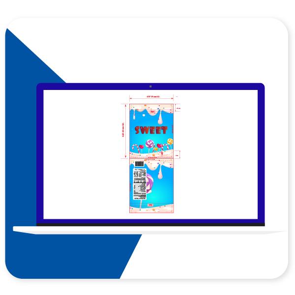
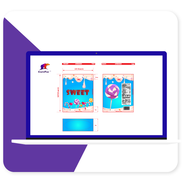
There are two types of dielines you'll see presented. A "multi-up" dieline or a as-print dieline. At Carepac we prefer using multi-up because it makes actual proofing easier, but many times you may work with a dieline that is as print.
As-Printed Layout

Multi-Up Dieline

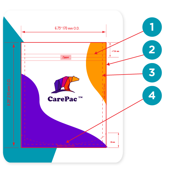
Reading your dielines
1. Zipper location
Yes you can print over the zipper area. Sealing the zipper into the bag does create some wripples / mild distortion so we don't recommend putting important mission critical items in the zipper area.
2. Outer edge of bag
On our dielines the edge is the edge, no additional bleed needed and nothing exists beyond this point. Over the years several customers have thought that the dimensions indicated are ID, inside diameter, which is false. All the dimensions are O.D. Outside diameter.
3. Seal Zone
Seal zones are where the material of the front and back of the bag are sealed together. Seal zones are printable space, the only suggestion is to not put something like a barcode in the seal zone as, similar to zippers, seal zones can have a slight bit of distortion.
4. Gusset Zone
Gusset zones are like seal zones never put a window area in a gusset, as this area will not look good if you put clear window over it.

Dieline Color Bars
Dielines use various "off canvas" colors to denote physical elements of the bag. These colors should contrast with the artwork, so they are easy to identify. Tese are technically the dielines. Here are some examples of dieline colors, with their corresponding label.


Pouch designs will include alot of content which is not actually printed on the pouch. This content is there to convey various specifications. For example when designating areas of clear or unprinted area, merely making those areas transparent in the AI file is not a good practice, why? Because white and transparent can be confused, also your AI files are going to be converted to other file formats for printing (for example rip station files) and ensuring that the person making the conversion understands your intensions is key.
It's important to designate various items such as:
- Clear unprinted areas
- Metalized unprinted area
- Matte, Gloss, and Spot UV finish areas.
- Areas of white ink base and areas without white ink base.
- Metalized printed areas (different than unprinted metalized areas)
Using Art Boards vs Layers
The decision of using separate art boards or layers is up to you, but typically we suggest layers, even for "off-canvas" layout information such as white ink base areas. This is because you can overlay layers to ensure their locations correctly correspond to the printed areas.
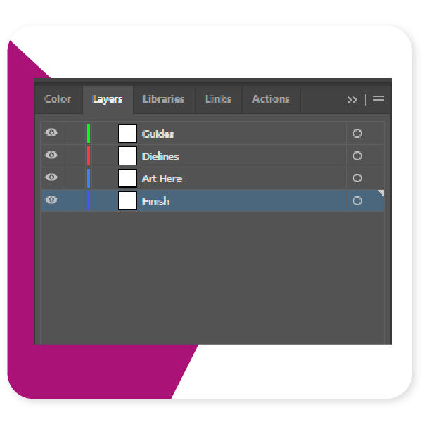
Setting Up Your Layers
There are some basic best practices to follow when setting up your layers. Firstly, do not mix the dieline and art layers, this can create errors, and just makes for messy files. Second, if you are designating finish locations for spot UV or matte varnish, use a separate layer for those purposes.
1. Separate Dielines from art
2. All art on one layer
3. Finish designation layer separate from art.

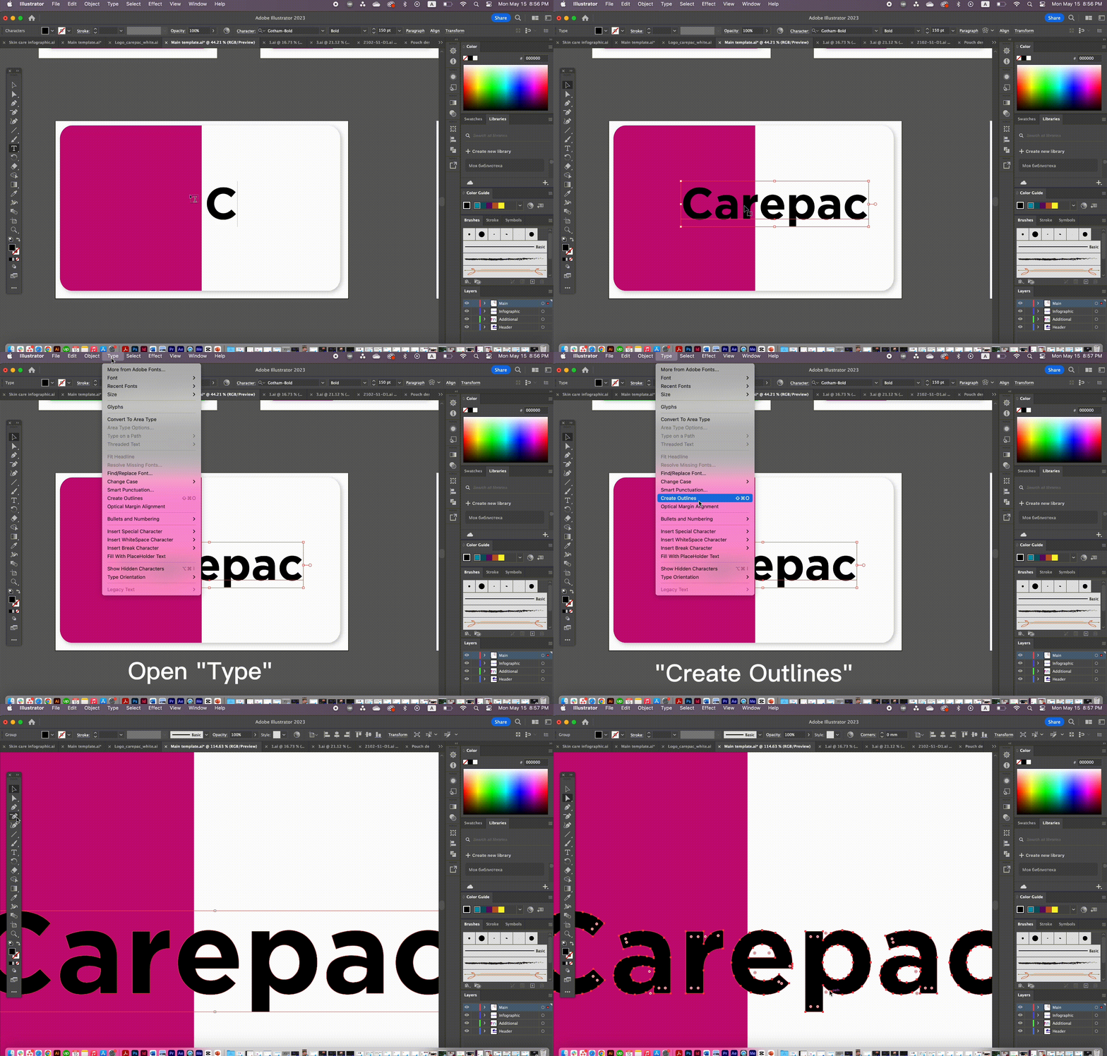
Outline all text
It's very common for designers to forget to outline their text. It is important to outline text to ensure that there are no versioning differences between different versions of a font file. If you've used a paid font, then we won't have that font, and if you've downloaded a free font from DaFont, Fontspace, fontsquirrel, or any of the numerous font sites, they all will have slightly different versions of the file than what we might have.

Define Color Swatches
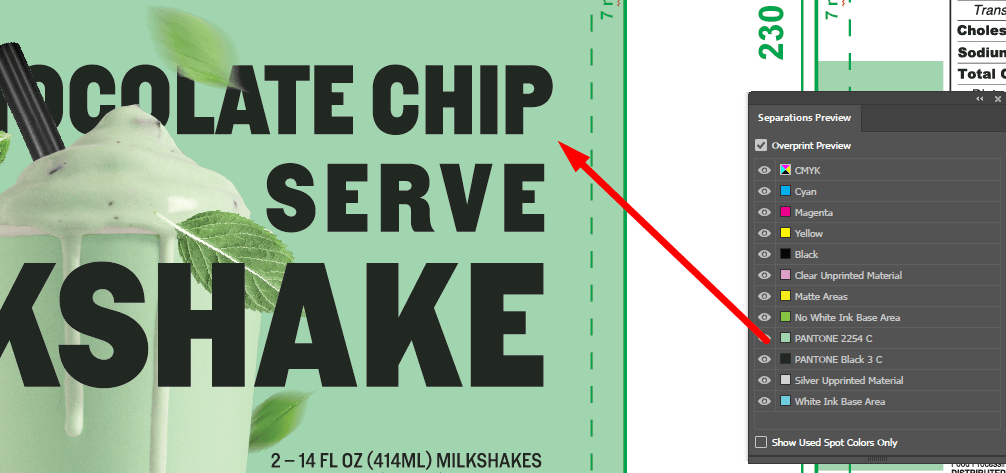
Messy Color swatches, or failing to setup any swatches is something we see almost daily. Adobe's built in color swatches allows for color separation and is especially helpful when working with spot ink colors, such as Pantone colors. In the picture below the designer has correctly separated and assigned PMS colors to the art work. Spot ink colors are colors created through the combination of specific ink colors instead of CMYK. Spot colors can be more consistent across print runs, and allow for color matching to pantone ink swatch decks.

Pantone Colors
While talking about Spot colors we should probably address the whole Pantone v. Adobe issues.
Pantone and Adobe have been in a bit of a tussle and pantone colors libraries are no longer a free part of adobe illustrator. This has created some issues as the pantone libraries that are freely available are now out of date. There are a few work arounds that we'll tell you about.
The first is of course the official Pantone Plugin. Pantone has released Pantone Connect which is a paid service, part of which is the pantone connect plugin. If you have the Pantone connect plugin then you have access to all the current Pantone colors (as of writing this Pantone Connect is $59/year).
There are a couple of ways to handle things if you don't pay for the plugin. First lets talk about something most people don't understand, screen color is not the same as color on paper (or plastic). Here's the secret, it doesn't matter if you have the plugin or not, as long as you have the physical pantone book.
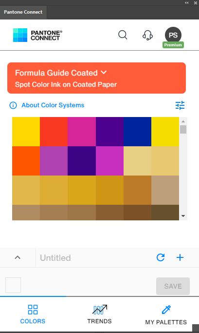

You can use whatever color you want to designate your spot.
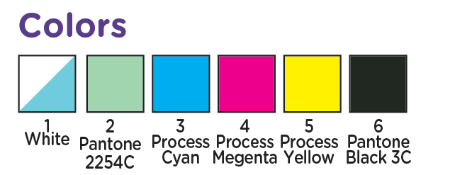
Yes you heard me right, whether you have the plugin or not, it's really irrelevant for our purposes because, screen colors are not very accurate to being with. As long as you designate the color number correctly in your color section (and assign it a swatch in the Color swatches), then we'll know what you're talking about. Since for Pantones to have any real value you should be referencing the printed color decks anyways.

Don't Forget Your Links!
One of the most common issues we run into when setting up customer's art is the missing link. It's easy to forget those pesky linked files, but without them we can't take your files to press. So Lets remember to embed the linked files or include the links folder in your export.


Tags
