No products in the cart.
Pouch Packaging Design & Inspiration
Pouch Packaging Design & Inspiration (w/ Free Printable Templates)
Think of a few of your favorite brands.
Is their product packaging bright and cheerful, minimalist and sophisticated, dark and elegant, or something else entirely?
Many of us simply “choose” a product on autopilot. We seldom stop to consider why we picked up that specific product off the shelf. This is the power of good branding!
The design of your pouch packaging is the first interaction you’ll have with a potential customer.
What kind of impression do you want to make? How will your branding communicate the values of your business and the quality of your product?
These are important questions to ask yourself when thinking about design elements of your pouch packaging. Your packaging is more than just a way to seal your product. Compelling packaging is a visual canvas that can help to differentiate your product from competitors and allow you to stake a unique identity in the market. Through your design, you can communicate specific emotions, desires, and values to your customers. And thoughtful branding does this all at a subliminal level.
Eye-catching graphics, carefully chosen typography, and unified color schemes, can also significantly influence purchasing decisions and help your product stand off the shelf.
Compelling branding gives your product longevity; reeling in new customers with your design, and turning them into loyal, long-term brand advocates through your product quality and values.
But it’s not just as easy as slapping a logo and some colors together and calling it a day…
With an endless combination of colors, fonts, and design styles to choose from, creating a compelling and unified visual brand can feel intimidating. Not all of us have the time or energy to learn what feels like an entirely new language.
Keeping this in mind, we’ve highlighted some unique and varied brand identities below to help give you some inspiration and useful tips for your pouch packaging.
Better Coffee Co: Bold Coffee Branding
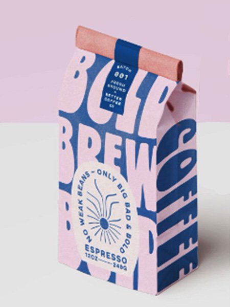
Better Coffee Co chose a playful and bold design that pays homage to the groovy typefaces of 60’s counterculture. The packaging gives their product both a casual and refined feel. A light airy pink and blue creates bold juxtaposition and contrast, and reflects their brand’s slogan “no weak beans, only big, bad, and bold”.
Their design also is influenced by the popular “Corporate Memphis' ' branding style; which emphasizes bold and cheerful color palettes, exaggerated shapes, and a playful minimalism. It’s familiar yet also refreshing and new. This gives their packaging a sense of easiness and comfort, while retaining a distinct and original feel.
Roastworks: Elegant And Luxurious Coffee Packaging
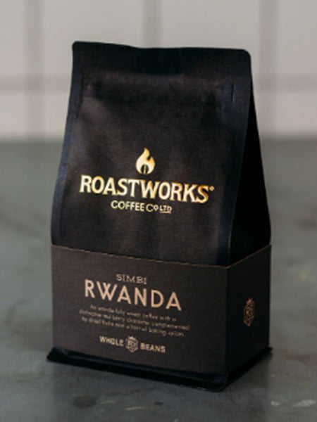
In contrast, Roastworks Coffee Co chose an elegant luxury feel for their coffee packaging. The black bag, gold serif lettering, and a deep mahogany colored sleeve take inspiration from the timeless styles of other luxury brands, such as Tom Ford and classic British car manufacturer Bentley. This combination contributes to a sense of exclusivity and refinement; this is coffee for people who care about good coffee.
The subtle embossed details on the raised serif font logo and sleeve draws in the customer's eyes and speaks to the importance of craftsmanship of their product. With the bright gold color helping the product to stand out on store shelves, Roastworks shows how classic elegance and attention to detail create a distinct first impression.
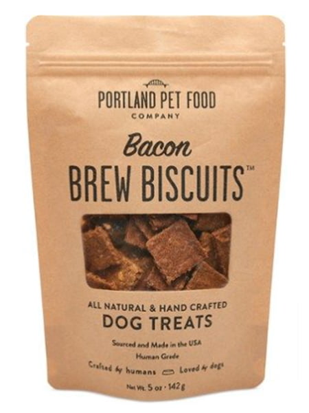
Portland Pet Food: Straightforward Pet Treat Branding
Portland Pet Food shows how an uncomplicated branding style can still stand out.
Compared to the often chaotic and crowded packaging designs of large name brand pet treats, Portland Pet Food emphasizes simplicity. By using negative space and a large confident font styling and pairings, their dog treat branding gives an impression of homemade quality that speaks for itself. By including a plastic window, trust is also built with consumers who aren’t looking for highly processed and low-quality products.
This classic paper pouch design emphasizes a commitment to the natural products they use in their treats, and pairs well with their slogan, “Crafted by humans, loved by dogs.”
If you’re looking for a simple and cost effective branding style, consider taking inspiration from Portland Pet Treats
Sandro Desii: Classic and Refined Packaging
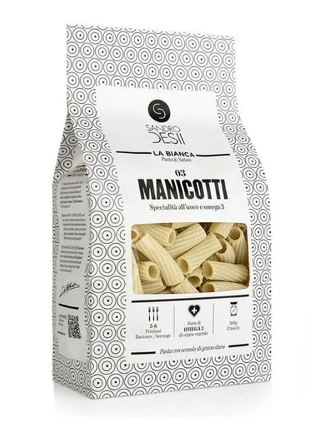
Taking inspiration from the symmetry and expertly crafted simplicity of their product, Sandro Desii chose an elegant and modern packaging design with geometric shapes inspired by their pasta. The circular patterns do more than provide texture to their packaging, it also frames and centers the eye on the product window and description.
A high contrast, dark typography integrates a simple sans-serif with classic and historically influenced italic serif font. Which gives their packaging a feeling of both old-world familiarity and modern elegance.
If you’re looking to showcase your product with a contemporary and clean design, this packaging from Sandro Desii can serve as a tasteful inspiration.
Macaroots: Simple Earthy Pouch Packaging
When you’re hungry for a snack, you often grab the first thing that catches your eye.
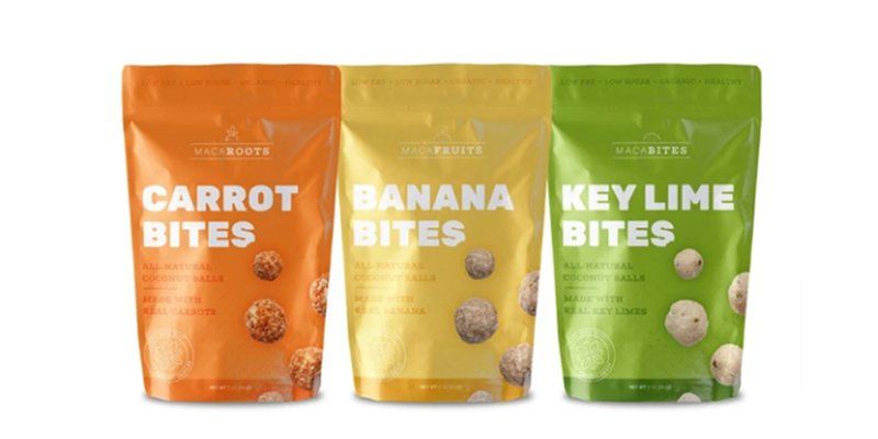
With this in mind, Macaroots created a fun and casual pouch packaging design that stands off the shelf.
The simple and warm palette connects the primary ingredient and flavor of each snack to the packaging color. And rather than go with bright and loud color tones, Macaroots chose an earthy and retro feel that speaks to their use of natural ingredients and health focused convenience.
The bold white typography also helps the product catch consumer attention, speaking to the unique aspect of the product itself. These aren’t chips, bars, or granola snacks; they’re bites and they have one primary ingredient.
By choosing a darker, complimentary shade for the product description copy, the consumer's eyes are drawn immediately to the primary text. This gives the illusion of minimalism from afar, while still providing the detailed product descriptions that health conscious consumers want.
Haven’s Kitchen: Stylish Clear Pouch Packaging Design
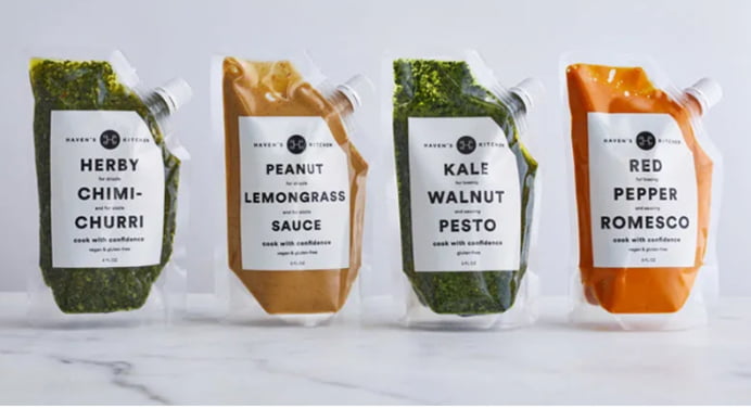
With their clear packaging pouch design, Haven Kitchens takes you as close as they can to their sauces without putting it directly on your plate.
As a reflection of their detail to quality and freshness of ingredients in its sauces and herb blends, they opted for a unique and minimalist see through pouch packaging option. Approachable, distinct, and captivating to the senses, the rich colors of their sauces speak through the monochromatic black and white design. While other brands hide their sauces, Haven Kitchens puts them right in front of the consumer, letting their product speak for itself.
By proudly displaying the product, they also minimized the need for complex branding and lettering design. A simple three-tiered sans-serif primary typography moves the eyes down the packaging, where specific instructions are subtly placed between. The result is a contemporary design that speaks to the foodie who doesn’t feel like whipping up an extra sauce for dinner.
