No products in the cart.
5 Tips for Jerky Packaging That
Sells and 10 Companies Who Get it Right
If you’re just getting started or looking to refresh your beef jerky packaging design, start here.
With five tips to create a packaging design that sells and some current sellers for inspiration, you’ll easily get started off on the right foot. Learn more package design tips below.
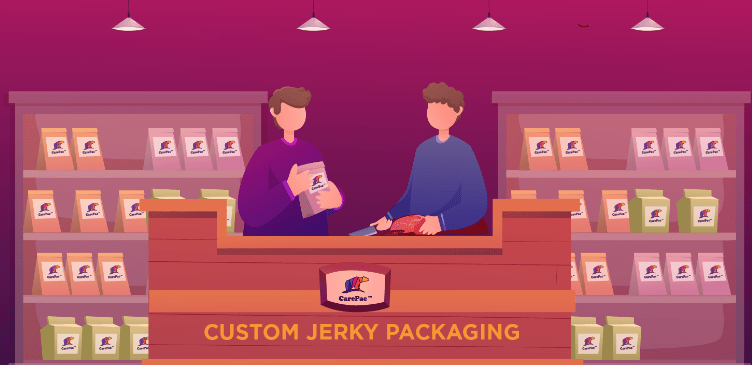

5 Tips to Consider for Your New Jerky Packaging Design
1. Matte Finish Packaging For a Sleek Look
Matte coloring packages have started to trend among plenty of jerky packaging companies looking to create a certain aesthetic for their meat. Matte black is the biggest trend, but any matte finish packaging, in general, gives a polished and handsome look to any jerky package. It's sleek and suave as a design element and is effective at drawing attention (think of matte finishes on cars or in homes). Matte finishes, especially blacks, add dimension to packaging and are bold as well. Not to mention, when it comes to packaging, matte finishes are textural in that consumers often find themselves wanting to run their fingers along the smooth, sleek finish.
2. Resealable & Flexible Jerky Packaging
Resealable packaging is a major plus for temporary snack food like jerky. Jerky is, by definition, a preserved food but having a resealable container to lock in the flavor and freshness is an attraction to buyers who know they want to snack and store it. Jerky is not only a snack, but it's a popular on-the-go snack, which is why a combination of resealable packaging with a flexible container is a solid combo. Flexible beef jerky bags make it easier to store jerky in backpacks, coolers, pockets, center consoles, and more. As a food of convenience, it's trendy but also attractive to make it convenient to buy.
3. Bold Branding on Your Beef Jerky Packaging
Bold, often masculine branding often makes for a great package of jerky. Bold, loud, identifiable flavors pair well with bold colors, loud fonts, and iconic packaging. Consider pairing a bold font with a soft color palette or a bold color palette with subtle fonts, so your packaging doesn't overwhelm. Fonts with a touch of masculine edge help attract meat-lovers who often enjoy beef jerky are another consideration. Bold can fonts can also be paired with a minimalist design to evoke bold flavors with your basic, no-frills beef jerky. Branding that is loud is different than bold, which is why finding the right balance of bold and subtle elements is key!
4. A Sneak-Peek Window So Customers Can See the Meat Snacks
There's a popular expression about how we eat first with our eyes before we eat with our mouth, and to an extent, this carries a lot of truth. If something looks enjoyable and appealing, we are more likely to enjoy it. It’s our first way of developing an appetite for something, which is why your brand may want to consider a viewing window in your packaging so that potential shoppers can get a look at their snack. It will whet their appetite and make them more likely to pick it off the shelf, especially if it looks as good as it tastes.
5. Eco-Conscious, Ethical, and Healthier Bags for Your Beef Jerky
When it comes to meats and produce, consumers tend to look for goods that are labeled: grass-fed, free-range, organic, non-GMO, low sugar, high protein, sustainable, gluten-free, limited ingredient, natural, cage-free, etc. If you can prescribe some of these labels, per FDA standards, to your jerky, it’s going to be a draw for your package. Banners across the top or bottom, badges on the front, or just placed in an eye-catching font or color alert your potential customers to the benefits of your healthier, sustainable, or more ethical jerky than the competitor. Another approach with the packaging to achieve this end is to utilize either compostable, biodegradable, or recyclable packaging, like those made of bio-plastics for a more sustainable effect for your flat barrier bags.
10 Jerky Companies to Look to for Design Inspiration
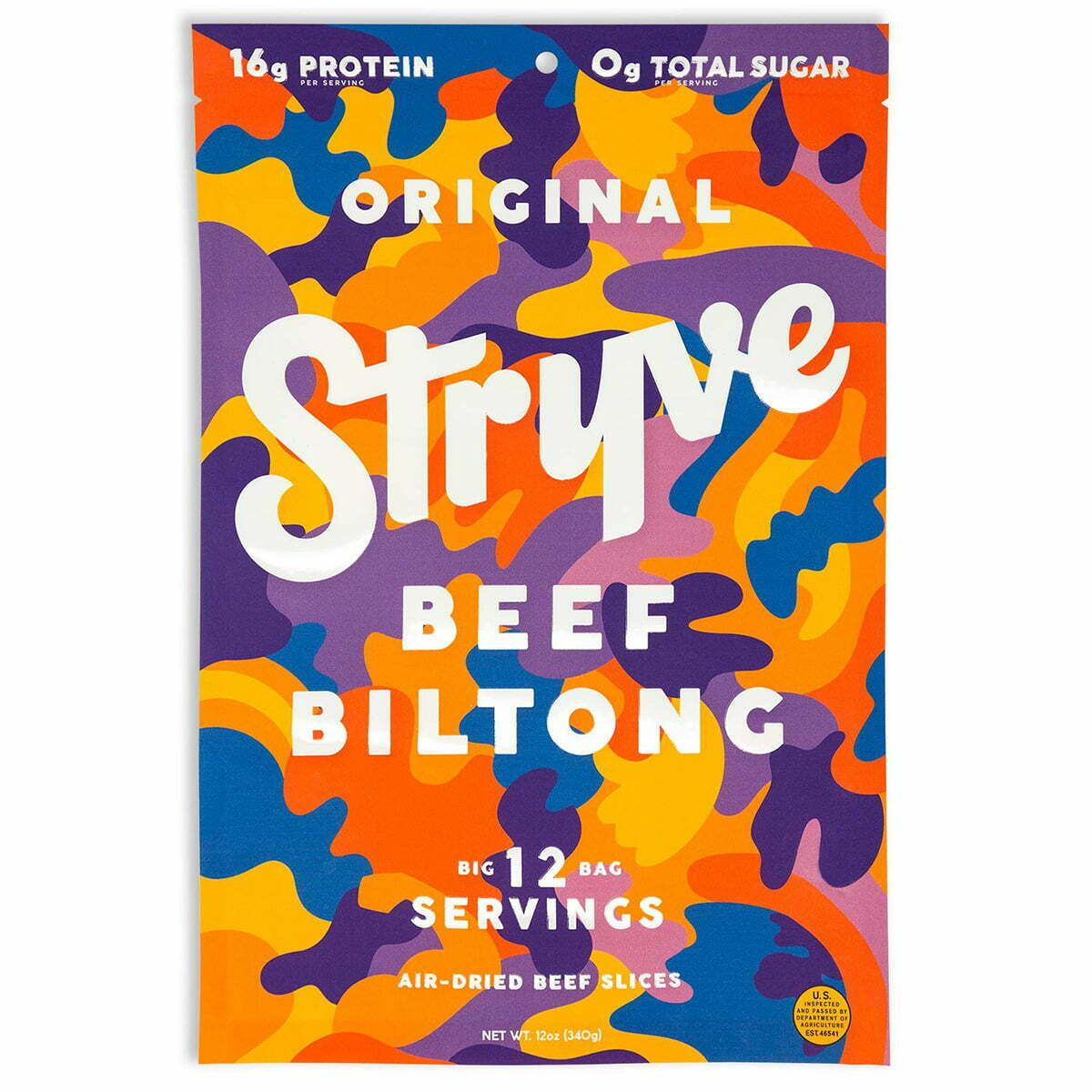

1. Stryve
Stryve hits a few great trends with its packaging. The bold, easy-to-read fonts placed on bright, matte packaging with a fun blend of colors combine eye-catching with convenience. The flexible packaging is also easy to store for later in small spaces, making this a great choice for on the go. Also included in their packaging are nutritional essentials, like the zero-sugar and high protein markers across the top.
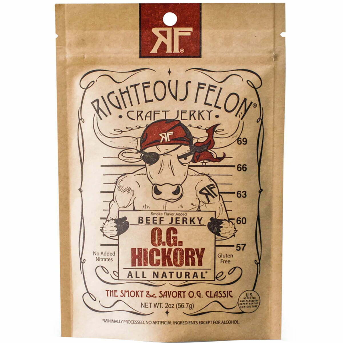

2. Righteous Felon
The Righteous Felon uses creative, fun, and engaging graphics that are immediately eye-catching. It's framed perfectly on their eco-friendly packaging, with a minimalist color palette of a touch of red. They incorporate all the key information, like flavor, gluten-free, and all-natural labels, into the primary graphic on the front. They also have a resealable pouch which further attracts buyers. It has a masculine name as well as a more masculine graphic, but in a fun, comical way so as to not seem overcompensating. Overall, it's fun meets functional in a great way.

3. Archer
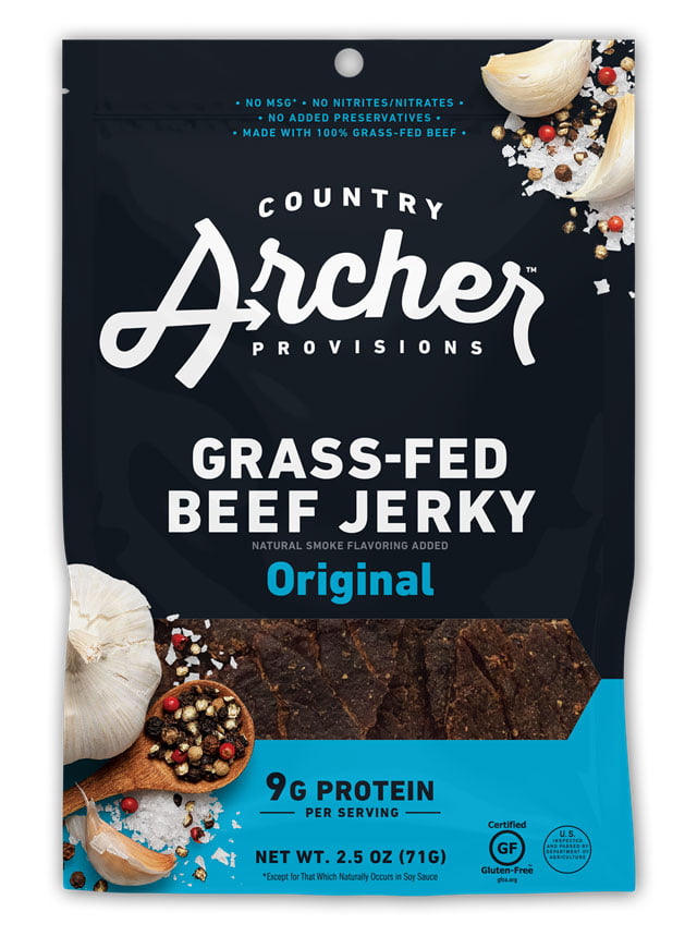
Country Archer Provisions plays off of colors to help identify their different flavors, with navy blue and light blue for their original flavor jerky. They use orange for a mango-habanero blend, magenta pink for their teriyaki flavor, and lime green for hatch chili. Their typography is straightforward and to the point, keeping it simple and not distracting but not too eye-catching as well. Their biggest wins are the flexible packaging, the health and ethical labels stamped on the front (9g of protein, gluten-free, etc.), and the viewing window in the front to buyers can see the freshness of their snack.

4. Lorissa’s Kitchen
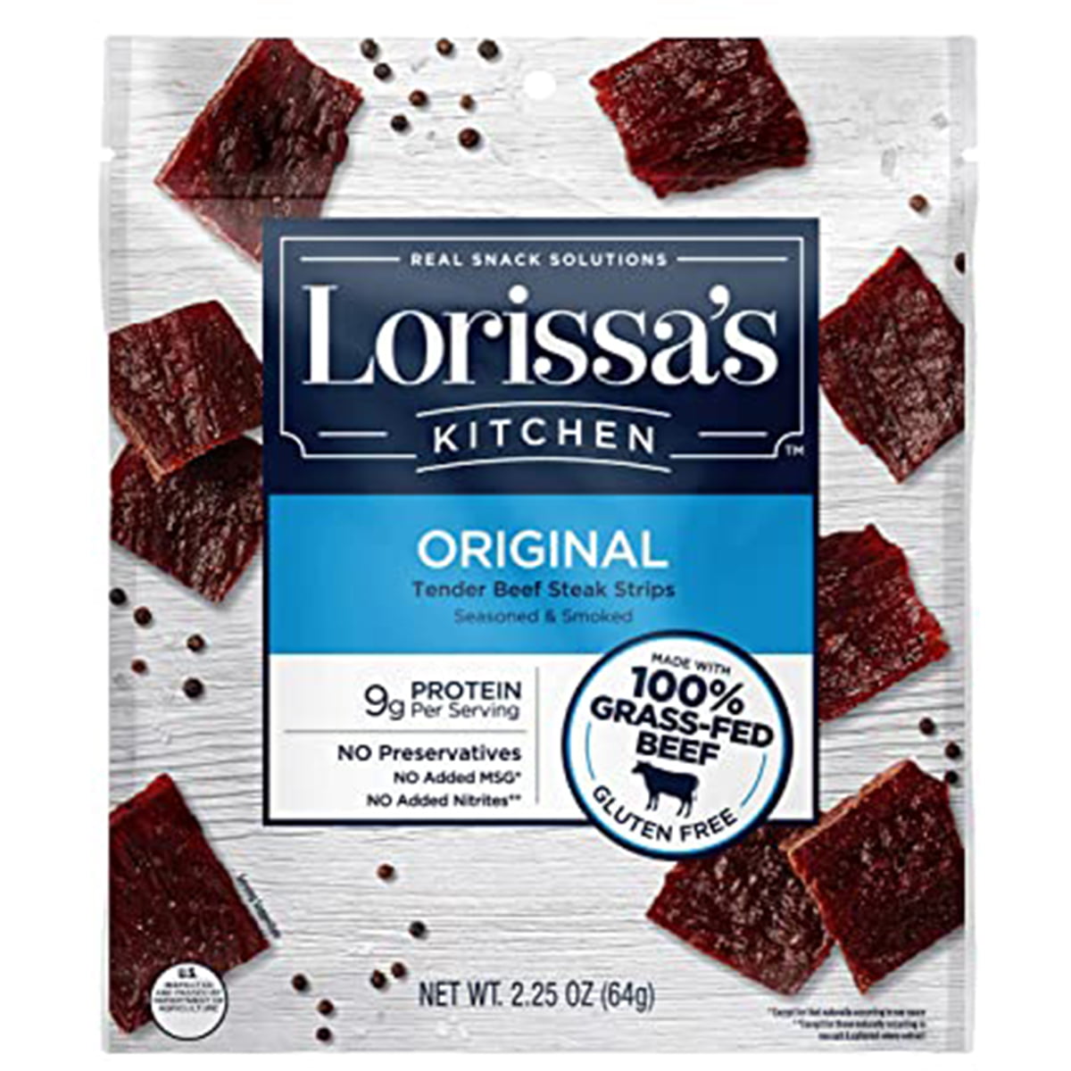
Lorissa’s Kitchen uses color to identify essential information: organic, grass-fed sustainable beef, gluten-free. Buyers know what they’re getting and are drawn in by the bright green labels. The packaging is flexible and has a resealable top for preserving freshness. They also use all the official labels for USDA Organic and NonGMO foods. Another big bonus is that they’ve printed images of their jerky all over the package, which isn’t as effective as having a viewing window but is better than nothing.

5. Savage Jerky Co
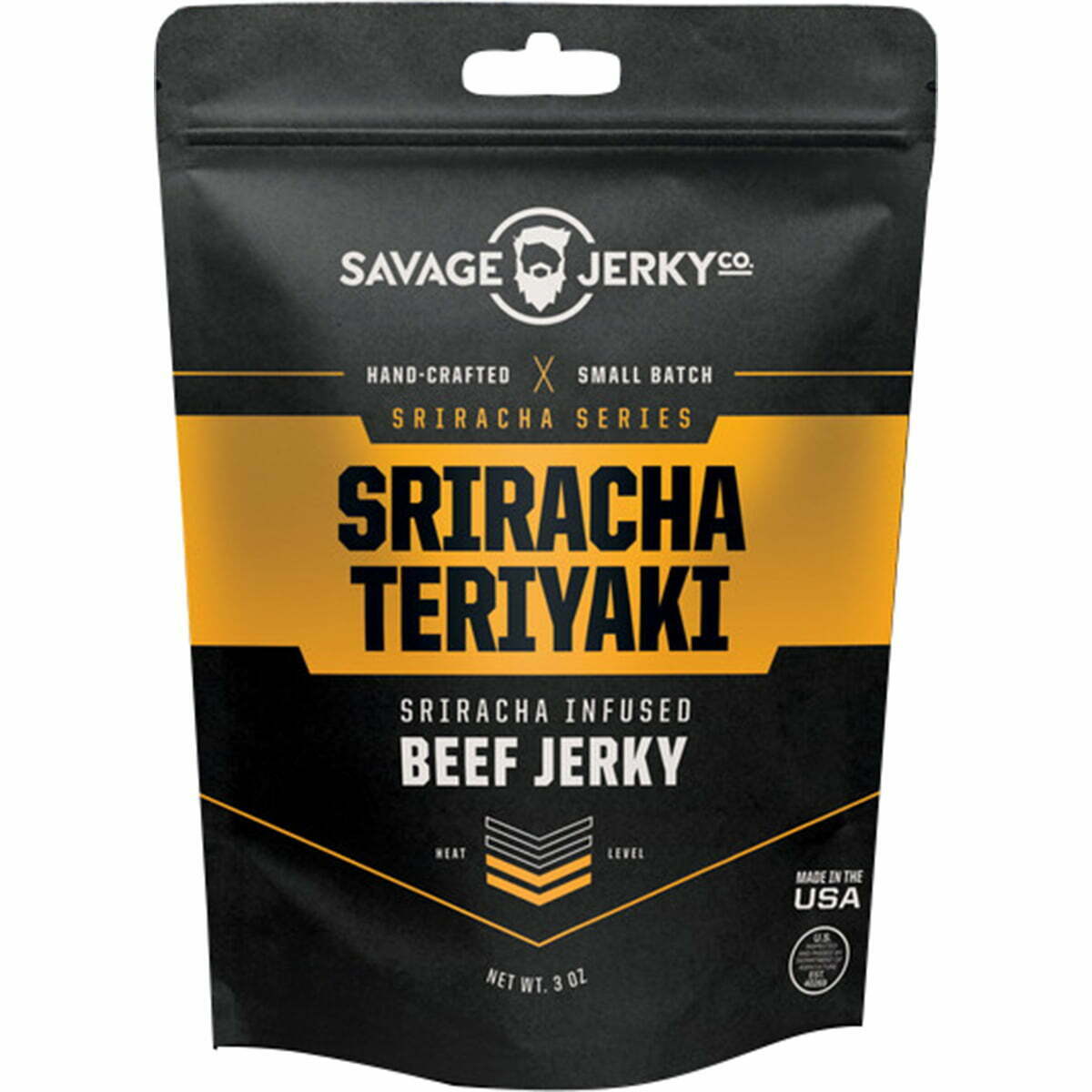
Savage Jerky Co uses matte black packaging to the best effect, with a sleek, smooth package with a lone bold color. This flavor, Reaper, uses a vibrant red, while other flavors use different colors, like Maple Buffalo Bacon in burnt orange and Lime & Garlic with rich green. It makes their packaging bold but iconic and not too busy or loud. The package has a tear-top and a resealable closure for freshness, plus the flexible packaging for the convenience of carrying it everywhere. Their logo is simple and memorable, just like the rest of their package.

6. Uncle Buck’s Original
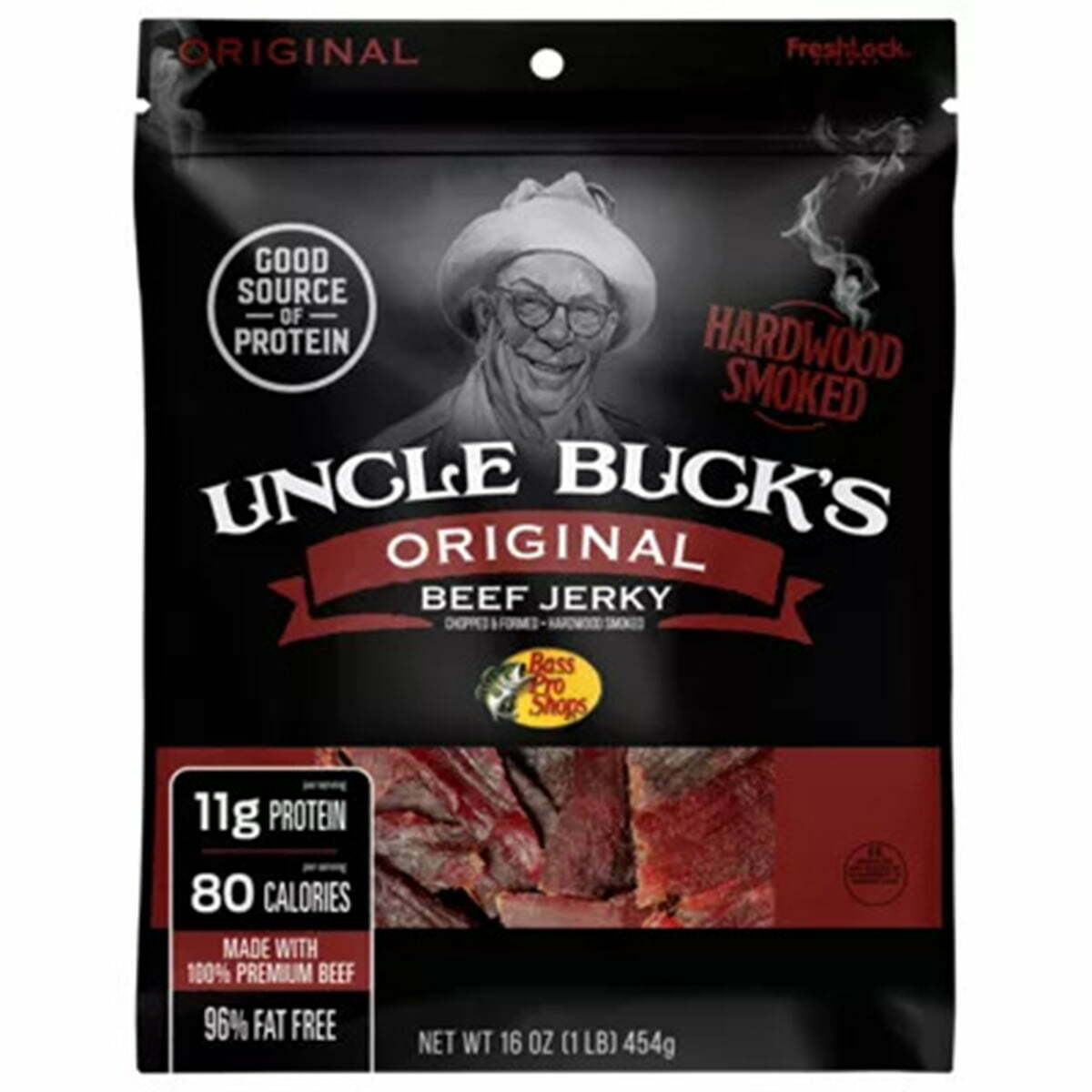
Uncle Bucks’ Original Beef Jerky is in a matte black finish, similar to a lot of other stand-out brands. It’s handsome and masculine, with a simple font pairing that doesn’t detract from the logo and information. They don’t use a viewing window, but like Lorissa’s, they print an image of their jerky on the front of the package. Printing images can be great when you don’t use a viewing window, but your final product should look very similar to the printed images. They also include essential information on the front, including protein, calories, and fat-free.
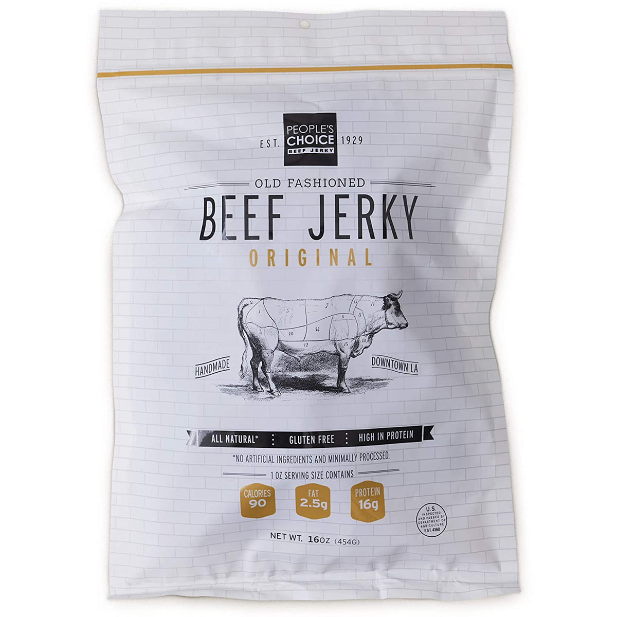

7. People’s Choice Old Fashioned Beef Jerky
The packaging for People's Choice Old Fashioned Beef Jerky evokes old-fashioned energy and traditional simplicity with its graphics, fonts, and logos. The overall design is constructed of thin lines, thin fonts, and kerning that makes everything simple, minimal, and legible. They incorporate big selling points into creative graphics, like banners and stamps across the packaging to identify "Handmade in LA," “ Gluten-Free," "All-Natural," and the fat and protein counts. Visually, it's a mostly black and white color palette, which goes with the theme of old-fashioned and traditional. Although it is in flexible packaging, they don't use a reseal top for preserving what's left uneaten.
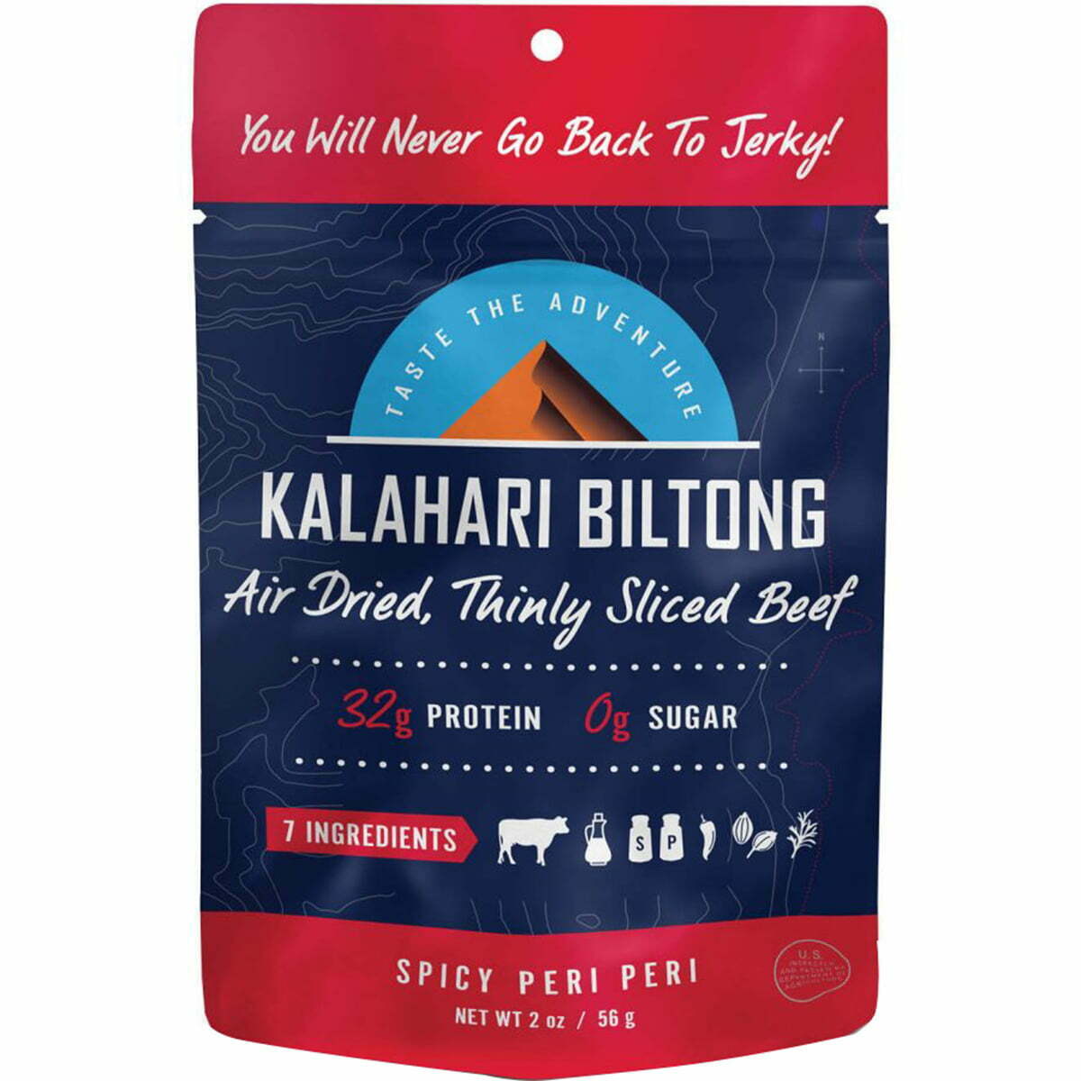

8. Kalahari Biltong
Kalahari Biltong keeps it vibrant, colorful, and eye-catching with flavor-coordinated colors that are bold and bright- orange for original, lime green for chili lime, red for their spicy peri, and blue for garlic. All the colors are extremely bright and pair well with a consistent package graphic across all the flavors. They creatively pair a san serif and script font, and they use it to convey all the necessary information.
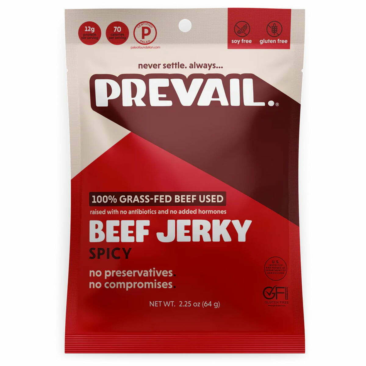

9. Prevail Beef Jerky
Prevail is another brand that combines the matte finished packaging but, unlike some of the others, uses a monochrome color palette, like the oranges shown here. Their other flavors use a similar method, but with green tones for their lemongrass flavor, blue tones for their original flavor, and red tones for their spicy flavor. The matte finish is smooth and refined but keeps it simple and handsome. The fonts are in either all capital letters or all lower-case letters, which pair well together with san serif choices. They use the same colors to convey their information in stamps (gluten-free, protein count, soy-free, etc.).
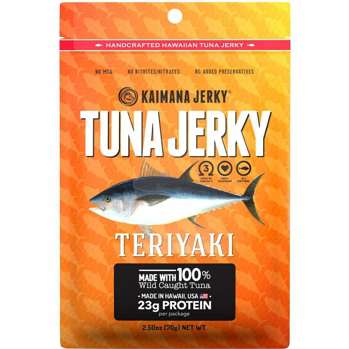

10. Kaimana Jerky
Salmon jerky is often seen as a healthier, better-for-you version of beef jerky, like Kaimana Salmon Jerky. Along with selling a healthier version of the product, their packaging appeals to the type of buyer who is more likely to go for healthier choices- those who are also eco-conscious. The packaging is environmentally friendly, with compostable packaging that is printed without colors to look even more natural and earth-friendly. Their logo and graphics are simply printed in shades of brown, black, and white to keep things minimal and attractive, as well.
Luckily, a lot of these great ideas can be achieved at an affordable quote from this site, simply email us. With CarePac, you can transform your packaging without blowing up your budget on the web. Reach out for more information or to order some samples to see your packaging first-hand! Email us -- we'd be happy to provide a quote.

Tags

